
Thesis is a large typeface family designed by Luc(as) de Groot. The typefaces were designed between 1994 and 1999 to provide a modern humanist family. Each typeface is available in a variety of weights as well as in italic. Originally released by FontFont in 1994, it has been sold by de Groot through his imprint LucasFonts since 2000.[1][2]
Thesis fonts have become popular and can be seen in various publications or logotypes.
To create a varied range of fonts of different thicknesses and levels of condensation, Thesis was developed using multiple master technology, in which weights were created by 'averaging' and extending the trend between a thick and thin design to create a smooth, continuous trend in styles from thin to very bold. The fonts also include a large number of stylistic alternate characters.[3]
The family is a font superfamily, since it includes both serif and sans-serif designs.
YouTube Encyclopedic
-
1/1Views:162 335
-
Complete Thesis Formatting Guidelines || Thesis Setting
Transcription
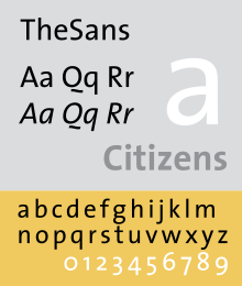
TheSans
A humanist sans-serif font family, somewhat similar to Syntax (1968) and Frutiger (1976). It included fonts in 8 weights and 2 widths, with complementary italic fonts. A distinctive figure is the 'Q' with the detached tail, somewhat similar to that on Dwiggins' Metro; an alternate is provided for when this is unsuitable.
In TheSans Condensed, each weight only includes roman and italic, but all 4 number styles can be found.
TheSansMono
It is a monospaced variant. 3 widths have been produced. All fonts use hanging monospaced figures.
TheSansTypewriter
It is a monospaced variant with ragged strokes. It included fonts in regular and bold weights in the widest TheSansMono width, with complementary italic fonts. It uses hanging monospaced figures.
TheSerif
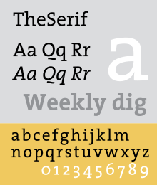
It is a slab serif font family. It included fonts in 8 weights and 1 width, with complementary italic fonts.
TheMix
It is a slab serif font family, but using only serif on upper portion of small letters. It included fonts in 8 weights and 1 width, with complementary italic fonts.
TheMixMono
It is a monospaced variant. Each weight only includes roman and italic. All fonts use hanging monospaced figures.
TheMix Arabic
It is a variant designed by Lucas de Groot, Arab calligrapher and designer Mouneer Al-Shaarani, and with technical support from Pascal Zoghbi. Lucas designed the Bold version of the type, while Pascal finalized the Bold design by modifying some glyphs, spacing and encoding/scripting the font, and later developed TheMix Arabic Regular.
The font was included in the Typographic Matchmaking Project organized by the Khatt Foundation.
Offshoot font families

Offshoot font families of the Thesis font superfamily include TheAntiqua,[4] Nebulae,[5] and JesusLovesYouAll.[6] [7]
TheAntiqua is a variant based on TheSerif. It included fonts in 7 weights and 1 width, with complementary italic fonts. OpenType feature includes small caps (roman only). TheAntiqua won an award in 1999 from Type Directors Club.[citation needed]
Collections
Each of the family are categorized in following family collections: Classic, Basic, Office.
Classic family includes all 8 font weights, with roman, italic, small caps roman, small caps italic, expert, expert italic in each weight. It includes hanging proportional, hanging monospaced, lining proportional, lining monospaced figures; and additional f-ligatures. Expert fonts include arrows, swashes, fraction figures, alternate styles, mathematic symbols, ornaments.
Basic family includes all 8 font weights, but without small caps and expert fonts. It includes lining proportional figures (smaller than in classic).
Office family only includes Regular and Bold weights, with only roman and italic in each weight. It includes hanging monospaced figures.
de Groot's choice of weights to release was developed using an "interpolation theory". The optical interpolation b, in the three stems a (thinnest), b (interpolation) and c (thickest), is set to the geometric mean of a and c, i.e. b² = ac (as opposed to the linear arithmetic mean).[8]
As an amusement, de Groot also developed a number of parodic reworkings of Thesis, including Nebulae and JesusLovesYouAll.[9]
Uses of Thesis fonts


- BG Group – now taken over[10]
- University of Zurich - TheSans[11]
- Marque Bretagne — TheMix[12]
- Office Depot — TheSerif
- Swisscom — TheSans and TheSerif [13]
- Victoria and Albert Museum — TheSans (custom variant)[14]
- Branding for the World Exposition 2000 in Hannover, Germany – TheSans [15]
- Deutsche Welle - TheAntiqua[16]
- ARD - TheSans and TheAntiqua
See also

References
- Middendorp, Jan. Dutch Type. 010 Publishers: 2004. ISBN 90-6450-460-1.
- ^ "About Thesis". LucasFonts. Retrieved 27 March 2023.
- ^ Ulrich, Ferdinand. "From Compressed Light to Extended Ultra". FontShop. Retrieved 19 August 2017.
- ^ Hardwig, Florian. "Jazz In Town poster". Fonts In Use. Retrieved 12 May 2016.
TheSans is a well-equipped font, featuring Ǖ, Ǘ, Ǚ and Ǜ, Vietnamese small-caps, six alternative ampersands and many more cool extras.
- ^ "TheAntiqua". LucasFonts.
- ^ "Nebulae". LucasFonts.
- ^ "JesusLovesYouAll". LucasFonts.
- ^ @LucasFontsNews (July 2, 2020). "[TheAntiqua is] not part per se, but yes, related. TheAntiqua is a child of the Thesis superfamily. Other children are Nebulae and JesusLovesYouAll" (Tweet) – via Twitter.
- ^ "Interpolation Theory". LucasFonts. Retrieved 7 July 2015.
- ^ "FontFabrik Type". FontFabrik. Retrieved 7 July 2015.
- ^ Coles, Stephen. "BG Group". Fonts in Use. Retrieved 12 May 2016.
- ^ "UZH Corporate Identity".
- ^ "BRETAGNE – Le site officiel de la marque Bretagne" (in French). Retrieved October 15, 2014.
- ^ "Swisscom Brand Center". brandcenter.swisscom.com. Archived from the original on 2014-01-11.
- ^ "Sources for the study of marketing in the V&A Archive" (PDF). V&A. Retrieved 4 March 2016.
A new typeface was developed specifically for the V&A, the 'V&A Sans' (adapted from TheSans font, which had been designed by Luc(as) de Groot in 1994
- ^ "Expo 2000 Corporate Identity: Typeface". Archived from the original on 6 October 2000. Retrieved 1 January 2019.
- ^ "Lucas Fonts - Deutsche Welle ad sales website".
External links
- Thesis super family: TheSans, TheSansTypewriter, TheSansMono, TheMix, TheMixMono, TheSerif
- TheAntiquaB
- identifont.com: FontFabrik
- TheMix Arabic: balancing handwritten and geometrically constructed letterforms.
- 29 Arabic Letters: TheMix Arabic
- Fonts In Use: TheSans, TheSerif, TheAntiqua, TheMix