
In molecular biology, an interactome is the whole set of molecular interactions in a particular cell. The term specifically refers to physical interactions among molecules (such as those among proteins, also known as protein–protein interactions, PPIs; or between small molecules and proteins[1]) but can also describe sets of indirect interactions among genes (genetic interactions).
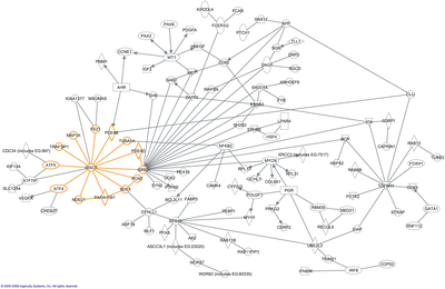
The word "interactome" was originally coined in 1999 by a group of French scientists headed by Bernard Jacq.[3] Mathematically, interactomes are generally displayed as graphs. Though interactomes may be described as biological networks, they should not be confused with other networks such as neural networks or food webs.
YouTube Encyclopedic
-
1/5Views:14 72956 7921 72216 3008 062
-
16. Protein Interaction Networks
-
Protein protein interaction
-
Protein Protein Interaction Network- PART 1 | History of Graph Theory
-
Brief Introduction of Protein-Protein Interactions (PPIs)
-
Methods to detect protein-protein interactions (PPIs)
Transcription
The following content is provided under a Creative Commons license. Your support will help MIT OpenCourseWare continue to offer high quality educational resources for free. To make a donation or view additional materials from hundreds of MIT courses, visit MIT OpenCourseWare at ocw.mit.edu. PROFESSOR: Going to finish up a little bit from last time on gene regulatory networks and see how the different methods that we looked at compared, and then we'll dive into protein interaction networks. Were there any questions from last time? OK. Very good. So recall that we start off with this dream challenge in which they provided unlabeled data representing gene expression data for either in a completely synthetic case, in silico data, or for three different actual experiments-- one in E. coli, one in S. cerevisiae, and one in aureus. For some of those, it was straight expression data under different conditions. In other cases, there were actual knock-down experiments or other kinds of perturbations. And then they gave that data out to the community and asked people to use whatever methods they wanted to try to rediscover automatically the gene regulatory networks. So with some preliminary analysis, we saw that there were a couple of main clusters of kinds of analyses that all had similar properties across these data sets. There were the Bayesian networks, that we've discussed now in two separate contexts. And then we looked at regression-based techniques and mutual information based techniques. And there were a bunch of other kinds of approaches. And some of them actually combine multiple predictors from different kinds of algorithms together. And some of them, they evaluated how well each of these did on all the different data sets. So first the results on the in silico data, and they're showing this as an area under the precision-recall curve. Obviously, higher numbers are going to be better here. So in this first group over here are the regression-based techniques, mutual information, correlation, Bayesian networks. Things didn't fall into any of those particular categories. Meta were techniques that use more than one class of prediction and then develop their own prediction based on those individual techniques. Then they defined something that they call the community definition, which they combine data from many of the different techniques together with their own algorithms to kind of come up with what they call the "wisdom of the crowds." And then R represents a random collection of other predictions. And you can see that on these in silico data, the performances don't dramatically differ one from the other. Within each class, if you look at the best performer in each class, they're all sort of in the same league. Obviously, some of the classes do better consistently. Now their point in their analysis is about the wisdom of the crowds, that taking all these data together, even including some of the bad ones, is beneficial. That's not the main thing that I wanted to get out of these data for our purposes. So these E. coli data, notice though that the errant to the curve, it's about 30 something percent. Now this is, oh, sorry, this is in silico data. Now this is the first real experimental data we'll look at, so this is E. coli data. And notice the change of scale, that the best performer's only doing under less than 10% of the possible objective optimal results. So you can see that the real data are much, much harder than the in silico data. And here the performance varies quite a lot. You can see that the Bayesian networks are struggling, compared to some of the other techniques. The best of those doesn't really get close to the best of some of these other approaches. So what they did next, was they took some of the predictions from their community predictions that were built off of all these other data, and they went and actually tested some of these. So they built regulatory networks for E. coli and for aureus. And then they actually did some experiments to test them. I think the results overall are kind of encouraging, in the sense that if you focus on the top pie chart here, of all the things that they tested, about half of them, they could get some support. In some cases, it was very strong support. In other cases, it wasn't quite as good. So the glass is half empty or half full. But also, one of the interesting things is that the data are quite variable over the different predictions that they make. So each one of these circles represents a regulator, and the things that they claim are targets of that regulator. And things that are in blue are things that were confirmed by their experiments. The things with black outlines and blue are the controls. So they knew that these would be right. So you could see that for pure R, they do very well. For some of these others, they do mediocre. But there are some, which they're honest enough to admit, they do very poorly on. So they didn't get any of their predictions right for this regulator. And this probably reflects the kind of data that they had, in terms of what conditions were being tested. So, so far, things look reasonable. I think the real shocker of this paper does not appear in the abstract or the title. But it is in one of the main figures, if you pay attention. So these were the results for in silico data. Everything looked pretty good. Change of scale to E. coli, there's some variation. But you can make arguments. These are the results for Saccharomyces cerevisiae. So this is the organism, yeast, on which most of the gene regulatory algorithms were originally developed. And people actually built careers off of saying how great their algorithms were in reconstructing these regulatory networks. And we look at these completely blinded data, where people don't know what they're looking for. You could see that the actual results are rather terrible. So the area under the curve is in the single digits of percentage. And it doesn't seem to matter what algorithm they're using. They're all doing very badly. And the community predictions are no better-- in some cases, worse-- than the individual ones. So this is really a stunning result. It's there in the data. And if you dig into the supplement, they actually explain what's going on, I think, pretty clearly. Remember that all of these predictions are being made by looking for a transcriptional regulator that increases in its own expression or decreases in its own expression. And that change in its own expression is predictive of its targets. So the hypothesis is when you have more of an activator, you'll have more of its targets coming on. If you have less of an activator, you'll have less of the targets. And you look through all the data, whether it's by Bayesian networks or regression, to find those kinds of relationships. Now what if those relationships don't actually exist in the data? And that's what this chart shows. So the green are genes that have no relationship with each other. And they're measuring here the correlation across all the data sets, between two pairs of genes, for which have no known regulatory relationship. The purple are ones that are targets of the same transcription factor. And the orange are ones where one is the activator or repressor of the other. And in the in silico data, they give a very nice spread between the green, the orange, and the purple. So the co-regulator are very highly correlated with each other. The ones that are parent-child relationships-- a regulator and its target-- have a pretty good correlation, much, much different from the distribution that you see for the things that are not interacting. And on these data, the algorithms do their best. Then you look at the E. coli data, and you can see that in E. Coli, the curves are much closer to each other, but there's still some spread. But when you look at yeast-- again, this is where a lot of these algorithms were developed-- you could see there's almost no difference between the correlation between the things that have no relationship to each other, things that are co-regulated by the same regulatory protein, or those parent-child relationships. They're all quite similar. And it doesn't matter whether you use correlation analysis or mutual information. Over here and in this right-hand panel, they've blown up the bottom part of this curve, and you can see how similar these are. So again, this is a mutual information spread for in silico data for E. coli and then for yeast. OK. So what I think we can say about the expression analysis is that expression data are very, very powerful for some things and are going to be rather poor for some other applications. So they're very powerful for classification and clustering. We saw that earlier. Now what those clusters mean, that's this inference problem they're trying to solve now. And the expression data are not sufficient to figure out what the regulatory proteins are that are causing those sets of genes to be co-expressed-- at least not in yeast. And I think there's every expectation that if you did the same thing in humans, you would have the same result. So the critical question then is if you do want to build models of how regulation is taking place in organisms, what do you do? And the answer is that you need some other kind of data. So one thing you might think, if we go back to this core analysis, like what's wrong? Why is it that these gene expression levels cannot be used to predict the regulatory networks? And it comes down to whether gene levels are predictive approaching levels. And a couple of groups have looked into this. One of the earlier studies was this one, now 2009, where they used microarray data and looked at mRNA expression levels versus protein levels. And what do you see in this? You see that there is a trend. Right there, R squared is around 0.2, but that there's a huge spread. So that for any position on the x-axis, a particular level of mRNA, you can have 1,000-fold variation in the protein levels. So a lot of people saw this and said, well, we know there are problems with microarrays. They're not really great at predicting mRNA levels or low in protein levels. So maybe this will all get better if we use mRNA-Seq. Now that turns out not to be the case. So there was a very careful study published in 2012, where the group used microarray data, RNA-Seq data, and a number of different ways of calling the proteomics data. So you might say, well, maybe some of the problem is that you're not doing a very good job of inferring protein levels from mass spec data. And so they try a whole bunch of these different ways of pulling mass spec data. And then they look, you should focus on the numbers in these columns for the average and the best correlations between the RNA data in these columns and the proteomic data in the rows. And you could see the best case scenario-- you can get these up to 0.54 correlation, still pretty weak. So what's going on? What we've been focusing on now is the idea that the RNA levels are going to be very well correlated with protein levels. And I think a lot of literature is based on hypotheses that are almost identical. But in reality, of course, there are a lot of processes involved. There's the process of translation, which has a rate associated with it. It has regulatory steps associated with it. And then there are degradatory pathways. So the RNA gets degraded at some rate, and the protein gets degraded at some rate. And sometimes those rates are regulated, sometimes they're not. Sometimes it depends on the sequence. So what would happen if you actually measured what's going on? And that was done recently in this paper in 2011, where the group used a labeling technique for proteins to [INAUDIBLE] and measure steady state levels of proteins and then label the proteins at specific times and see how much newly synthesized their protein was at various times. And similarly, for RNA, using a technology that allowed them to separate newly synthesized transcripts from the bulk RNA. And once you have those data, then you can find out what the spread is in the half lives of proteins and the abundance of proteins. So if you focus on the left-hand side, these are the determined half lives for various RNAs in blue and proteins in red. If you look at the spread in the red ones, you've got at least three orders of magnitude of range in stability in half lives for proteins. So that's really at the heart of why RNA levels are very poorly predictive approaching levels, because there's such a range of the stability proteins. And the RNAs also, they spread over probably about one or two orders of magnitude in the RNA stability. And then here are the abundances. So you can see that the range of abundance for average copies per cell of proteins is extremely large, from 100 to 10 to the eighth copies per cell. Now if you look at the degradation rates for protein half lives and RNA half lives, you can see there's no correlation. So these are completely independent processes that determine whether an RNA is degraded or a protein is degraded. So then when you try to figure out what the relationship is between RNA levels and protein levels, you really have to resort to a set of differential equations to map out what all the rates are. And if you know all those rates, then you can estimate what the relationships will be. And so they did exactly that. And these charts show what they inferred to be the contribution of each of these components to protein levels. So on the left-hand side, these are from cells which had the most data. And they build a model on the same cells from which they collected the data. And in these cells, the RNA levels account for about 40% of the protein levels, the variance. And the biggest thing that affects the abundance of proteins is rates of translation. And then they took the data built from one set of cells and tried to use it to predict outcomes in another set of cells in replicate. And the results are kind of similar. They also did it for an entirely different kind of cell types. In all of these cases, the precise amounts are going to vary. But you can see that the red bars, which represent the amount of information content in the RNA, is less than about half of what you can get from other sources. So this gets back to why it's so hard to infer regulatory networks solely from RNA levels. So this is the plot that they get when they compare protein levels and RNA levels at the experimental level. And again, you see that big spread and R squared at about 0.4, which at the time, they were very proud of. They write several times in the article, this is the best anyone has seen to date. But if you incorporate all these other pieces of information about RNA stability and protein stability, you can actually get a very, very good correlation. So once you know the variation in the protein stability and the RNA stability for each and every protein and RNA, then you can do a good job of predicting protein levels from RNA levels. But without all that data, you can't. Any questions on this? So what are we going to do then? So we really have two primary things that we can do. We can try to explicitly model all of these regulatory steps and include those in our predictive models and try to build up gene regulatory networks, protein models that actually include all those different kinds of data. And we'll see that in just a minute. And the other thing we can try to do is actually, rather than try to focus on what's downstream of RNA synthesis, the protein levels, we can try to focus on what's upstream of RNA synthesis and look at what the production of RNAs-- which RNAs are getting turned on and off-- tell us about the signaling pathways and the transcription factors. And that's going to be a topic of one of the upcoming lectures in which Professor Gifford will look at variations in epigenomic data and using those variations in epigenomic data to identify sequences that represent which regulatory proteins are bound under certain conditions and not others. Questions? Yeah? AUDIENCE: In a typical experiment, the rate constants for how many mRNAs or proteins can be estimated? PROFESSOR: So the question was how many rate constants can you estimate in a typical experiment? So I should say, first of all, they're not typical experiments. Very few people do this kind of analysis. It's actually very time consuming, very expensive. So I think in this one, it was-- I'll get the numbers roughly wrong-- but it was thousands. It was some decent fraction of the proteome, but not the entire one. But most of the data set's papers you'll read do not include any analysis of stability rates, degradation rates. They only look at the bulk abundance of the RNAs. Other questions? OK. So this is an upcoming lecture where we're going to actually try to go backwards. We're going to say, we see these changes in RNA. What does that tell us about what regulatory regions of the genome were active or not? And then you could go upstream from that and try to figure out the signaling pathways. So if I know changes in RNA, I'll deduce, as we'll see in that upcoming lecture-- the sequences-- the identity of the DNA binding proteins. And then I could try to figure out what the signaling pathways were that drove those changes in gene expression. Now later in this lecture, we'll talk about the network modeling problem. If assuming you knew these transcription factors, what could you do to infer this network? But before we go to that, I'd like to talk about an interesting modeling approach that tries to take into account all these degradatory pathways and look specifically at each kind of regulation as an explicit step in the model and see how that copes with some of these issues. So this is work from Josh Stewart. And one of the first papers is here. We'll look at some later ones as well. And the idea here is to explicitly, as I said, deal with many, many different steps in regulation and try to be quite specific about what kinds of data are informing about what step in the process. So we measure the things in the bottom here-- arrays that tell us how many copies of a gene there are in the genome, especially in cancer. And you can get big changes of what are called copy number, amplifications, or deletions of large chunks of chromosomes. You need to take that into account. All the RNA-Seq and microarrays that we were talking about in measuring transcription levels-- what do they actually tell us? Well, they give us some information about what they're directly connected to. So the transcriptomic data tells something about the expression state. But notice they have explicitly separated the expression state of the RNA from the protein level. And they separated the protein level from the protein activity. And they have these little black boxes in here that represent the different kinds of regulations. So however many copies of a gene you have in the genome, there's some regulatory event, transcriptional regulation, that determines how much expression you get at the mRNA level. There's another regulatory event here that determines at what rate those RNAs are turned into proteins. And there are other regulatory steps here that have to do with signaling pathways, for example, that determine whether those proteins are active or not. So we're going to treat each of those as separate variables in our model that are going to be connected by these black boxes. So they call their algorithm "Paradigm," and they developed it in the context of looking at cancer data. In cancer data, the two primary kinds of information they had were the RNA levels from either microarray or RNA-Seq and then these copy number variations, again, representing amplifications or deletions of chunks of the genome. And what they're trying to infer from that is how active different components are of known signaling pathways. Now the approach that they used that involved all of those little black boxes is something called a factor graph. And factor graphs can be thought of in the same context as Bayesian networks. In fact, Bayesian networks are a type of factor graph. So if I have a Bayesian network that represents these three variables, where they're directly connected by edges, in a factor graph, there would be this extra kind of node-- this black box or red box-- that's the factor that's going to connect them. So what do these things do? Well, again, they're bipartite graphs. They always have these two different kinds of nodes-- the random variables and the factors. And the reason they're called factor graphs is they describe how the global function-- in our case, it's going to be the global probability distribution-- can be broken down into factorable components. It can be combined in a product to look at what the global probability function is. So if I have some global function over all the variables, you can think of this again, specifically, as the probability function-- the joint probability for all the variables in my system-- I want to be able to divide it into a product of individual terms, where I don't have all the variables in each of these f's. They're just some subset of variables. And each of these represents one of these terms in that global product. The only things that are in this function, are things to which it's directly connected. So these edges exist solely between a factor and the variables that are terms in that equation. Is that clear? So in this context, the variables are going to be nodes. And their allowed values are going to be whether they're activated or not activated. The factors are going to describe the relationships among those variables. We previously saw those as being cases of regulation. Is the RNA turned into protein? Is the protein activated? And what we'd like to be able do is compute marginal probabilities. So we've got some big network that represents our understanding of all the signaling pathways and all the transcriptional regulatory networks in a cancer cell. And we want to ask about a particular pathway or a particular protein, what's the probability that this protein or this pathway is activated, marginalized over all the other variables? So that's our goal. Our goal is to find a way to compute these marginal probabilities efficiently. And how do you compute a marginal? Well, obviously you need to sum over all the configurations of all the variables that have your particular variable at its value. So if I want to know if MYC and MAX are active, I set MYC and MAX equal to active. And then I sum over all the configurations that are consistent with that. And in general, that would be hard to do. But the factor graph gives us an efficient way of figuring out how to do that. I'll show you in a second. So I have some global function. In this case, this little factor graph over here, this is the global function. Now remember, these represent the factors, and they only have edges to things that are terms in their equations. So over here, is a function of x3 and x5. And so it has edges to x3 and x5, and so on for all of them. And if I want to explicitly compute the marginal with respect to a particular variable, so the marginal with respect to x1 set equal to a, so I'd have this function with x1 equal to a times the sum over all possible states of x2, the sum over all possible states of x3, x4, and x5. Is that clear? That's just the definition of a marginal. They introduced a notation in factor graphs that's called a "not-sum." It's rather terrible, but the not-sum or summary. So I like this term, summary, better. The summary over all the variables. So if I want to figure out the summary for x1, that's the sum over all the other variables of all their possible states when I set x1 equal to a, in this case. So it's purely a definition. So then I can rewrite-- and you can work this through by hand after class-- but I can rewrite this, which is this intuitive way of thinking of the marginal, in terms of these not-sums, where each one of these is over all the other variables that are not the one that's in the brackets. So that's just the definition. OK, this hasn't really helped us very much, if we don't have some efficient way of computing these marginals. And that's what the factor graph does. So we've got some factor graph. We have this representation, either in terms of graph or equation, of how the global function can be partitioned. Now if I take any one of these factor graphs, and I want to compute a marginal over a node, I can re-draw the factor graph so that variable of interest is the root node. Right? Everyone see that these two representations are completely equivalent? I've just yanked x1 up to the top. So now this is a tree structure. So this is that factor graph that we just saw drawn as a tree. And this is what's called an expression tree, which is going to tell us how to compute the marginal over the structure of the graph. So this is just copied from the previous picture. And now we're going to come up with a program for computing these marginals, using this tree structure. So first I'm going to compute that summary function-- the sum over all sets of the other variables for everything below this point, starting with the lowest point in the graph. And we can compute the summary function there. And that's this term, the summary for x3 of just this fE. I do the same thing for fD, the summary for it. And then I go up a level in the tree, and I multiply the summary for everything below it. So I'm going to compute the product of the summary functions. And I always compute the summary with respect to the parent. So here the parent was x3, for both of these. So these are summaries with respect to x3. Here who's the parent? x1. And so the summary is to x1. Yes? AUDIENCE: Are there directed edges? In the sense that in f, in the example on the right, is fD just relating how x4 relates to x3? PROFESSOR: That's exactly right. So the edges represent which factor you're related to. So that's why I can redraw it in any way. I'm always going to go from the leaves up. I don't have to worry about any directed edges in the graph. Other questions. So what this does is it gives us a way to officially, overall a complicated graph structure, compute marginals. And they're typically thought of in terms of messages that are being sent from the bottom of the graph up to the top. And you can have a rule from computing these marginals. And the rule is as follows. Each vertex waits for the messages from all of its children, until it gets its-- the messages are accumulating their way up the graph. And every node is waiting until it hears from all of its progeny about what's going on. And then it sends the signal up above it to its parent, based on the following rules. A variable node just takes the product of the children. And a factor node-- one of those little black boxes-- computes the summary for the children and sends that up to the parent. And it's the summary with respect to the parent, just like in the examples before. So this is a formula for computing single marginals. Now it turns out-- I'm not going to go into details of this. It's kind of complicated. But you actually can, based on this core idea, come up with an efficient way of computing all of the marginals without having to do this separately for every single one. And that's called a message passing algorithm. And if you're really interested, you can look into the citation for how that's done. So the core idea is that we can take a representation of our belief of how this global function-- in our case, it's going to be the joint probability-- factors in terms of particular biological processes. We can encode what we know about the regulation in that factor graph, the structure of the graph. And then we could have an efficient way of computing the marginals, which will tell us, given the data, what's the probability that this particular pathway is active? So in this particular case, in this paradigm model, the variables can take three states-- activated, deactivated, or unchanged. And this is, in a tumor setting, for example, you might say the tumor is just like the wild type cell, or the tumor has activation with respect to the wild type, or it has a repression with respect to the wild type. Again, this is the structure of the factor graph that they're using and the different kinds of information that they have. The primary experimental data are just these arrays that tell us about SNiPs and copy number variation and then arrays or RNA-Seq to tell us about the transcript levels. But now they can encode all sorts of rather complicated biological functions in the graph structure itself. So transcription regulation is shown here. Why is the edge from activity to here? Because we don't want to just infer that if there's more of the protein, there's more activity. So we're actually, explicitly computing the activity of each protein. So if an RNA gets transcribed, it's because some transcription factor was active. And the transcription factor might not be active, even if the levels of the transcription factor are high. That's one of the pieces that's not encoded in all of those things that were in the dream challenge, that are really critical for representing the regulatory structure. Similarly, protein activation-- I can have protein that goes from being present to being active. So think of a kinase, that itself needs to be phosphorylated to be active. So that would be that transition. Some other kinase comes in. And if that other kinase1 is active, then it can phosphorylate kinase2 and make that one active. And so it's pretty straightforward. You can also represent the formation of a complex. So the fact that all the proteins are in the cell doesn't necessarily mean they're forming an active complex. So the next step then can be here. Only when I have all of them, would I have activity of the complex. We'll talk about how AND-like connections are formed. And then they also can incorporate OR. So what does that mean? So if I know that all members of the gene family can do something, I might want to explicitly represent that gene family as an element to the graph-- a variable. Is any member of this family active? And so that would be done this way, where if you have an OR-like function here, then this factor would make this gene active if any of the parents are active. So there, they give a toy example, where they're trying to figure out if the P53 pathway is active, so MDM2 is an inhibitor of P53. P53 can be an activator-related apoptosis. And so for separately, for MDM2 and for P53, they have the factor graphs that show the relationship between copy number variation and transcript level and protein level and activity. And those relate to each other. And then those relate to the apoptotic pathway. So what they want to do then is take the data that they have, in terms of these pathways, and they want to compute the likelihood ratios. What's the probability of observing the data, given a hypothesis that this pathway is active and all my other settings of the parameters? And compare that to the probability of the data, given that that pathway is not active. So this is the kinds of likelihood ratios we've been seeing now in a couple of lectures. So now it gets into the details of how you actually do this. So there's a lot of manual steps involved here. So if I want to encode a regulatory pathway as a factor graph, it's currently done in a manual way or semi-manual way. You convert what's in the databases into the structure or factor graph. And you make a series of decisions about exactly how you want to do that. You can argue with the particular decisions they made, but the reasonable ones. People could do things differently. So they convert the regulatory networks into graphs. And then they have to define some of the functions on this graph. So they define the expected state of a variable, based on the state of its parents. And they take a majority vote of the parents. So a parent that's connected by a positive edge, meaning it's an activator, if the parent is active, then it contributes a plus 1 to the child. If it's connected by a repressive edge, then the parenting active would make a vote of minus 1 for the child. And you take the majority vote of all those votes. So that's what this says. But the nice thing is that you can also incorporate logic. So for example, when we said, is any member of this pathway active? And you have a family member node. So that can be done with an OR function. And there, it's these same factors that will determine-- so some of these edges are going to get labeled "maximum" or "minimum," that tell you what's the expected value of the child, based on the parent. So if it's an OR, then if any of the parents are active, then the child is active. And if it's AND, you need all of them. So you could have described all of these networks by Bayesian networks. But the advantage of a factor graph is that your explicitly able to include all these steps to describe this regulation in an intuitive way. So you can go back to your models and understand what you've done, and change it in an obvious way. Now critically, we're not trying to learn the structure of the graph from the data. We're imposing the structure of the graph. We still need to learn a lot of variables, and that's done using expectation maximization, as we saw in the Bayesian networks. And then, again, it's a factor graph, which primarily means that we can factor the global function into all of these factor nodes. So the total probability is normalized, but it's the product of these factors which have to do with just the variables that are connected to that factor node in the graph. And this notation that you'll see if you look through this, this notation means the setting of all the variables consistent with something. So let's see that-- here we go. So this here, this is the setting of all the variables X, consistent with the data that we have-- so the data being the arrays, the RNA-Seq, if you had it. And so we want to compute the marginal probability of some particular variable being at a particular setting, given the fully specified factor graph. And we just take the product of all of these marginals. Is that clear? Consistent with all the settings where that variable is set to x equals a. Questions? OK. And we can compute the likelihood function in the same way. So then what actually happens when you try to do this? So they give an example here in this more recent paper, where it's basically a toy example. But they're modeling all of these different states in the cells. So G are the number of genomic copies, T, the level of transcripts. Those are connected by a factor to what you actually measure. So there is some true change in the number of copies in the cell. And then there's what appears in your array. There's some true number of copies of RNA in the cell. And then there's what you get out of your RNA-Seq. So that's what these factors are present-- and then these are regulatory terms. So how much transcript you get depends on these two variables, the epigenetic state of the promoter and the regulatory proteins that interact with it. How much transcript gets turned into protein depends on regulatory proteins. And those are determined by upstream signaling events. And how much protein becomes active, again, is determined by the upstream signaling events. And then those can have effects on downstream pathways as well. So then in this toy example, they're looking at MYC/MAX. They're trying to figure out whether it's active or not. So we've got this pathway. PAK2 represses MYC/MAX. MYC/MAX activates these two genes and represses this one. And so if these were the data that we had coming from copy number variation, DNA methylation, and RNA expression, then I'd see that the following states of the downstream genes-- this one's active. This one's repressed. This one's active. This one's repressed. They infer that MYC/MAX is active. Oh, but what about the fact that this one should also be activated? That can be explained away by the fact that there's a difference in the epigenetic state between ENO1 and the other two. And then the belief propagation allows us to transfer that information upward through the graph to figure out, OK, so now we've decided that MYC/MAX is active. And that gives us information about the state of the proteins upstream of it and the activity then of PAK2, which is a repressor of MYC/MAX. Questions on the factor graphs specifically or anything's that come up until now? So this has all been reasoning on known pathways. One of the big promises of these systematic approaches is the hope that we can discover new pathways. Can we discover things we don't already know about? And for this, we're going to look at interactome graphs, so graphs that are built primarily from high throughput protein-protein interaction data, but could also be built, as we'll see, from other kinds of large-scale connections. And we're going to look at what the underlying structure of these networks could be. And so they could arise from a graph where you put an edge between two nodes if their co-expressed, if they have high mutual information. That's what we saw in say, ARACHNE, which we talked about a lecture ago. Or, if say, the two hybrids and affinity capture mass spec indicated direct physical interaction or say a high throughput genetic screen indicated a genetic interaction. These are going to be very, very large graphs. And we're going to look at some of the algorithmic problems that we have dealing with huge graphs and how to compress the information down so we get some piece of the network that's quite interpretable. And we'll look at various kinds of ways of analyzing these graphs that are listed here. So one of the advantages of dealing with data in the graph formulation is that we can leverage the fact that computer science has dealt with large graphs for quite a while now, often in the context of telecommunications. Now big data, Facebook, Google-- they're always dealing with things in a graph formulation. So there are a lot of algorithms that we can take advantage of. We're going to look at how to use quick distance calculations on graphs. And we'll look at that specifically in an example of how to find the kinase target relationships. Then we'll look at how to cluster large graphs to find subgraphs that either represents an interesting topological feature of the inherent structure of the graph or perhaps to represent active pieces of the network. And then we'll look at other kinds of optimization techniques to help us find the part of the network that's most relevant to our particular experimental setting. So let's start with ostensibly a simple problem. I know a lot about-- I have a lot of protein phosphorylation data. I'd like to figure out what kinase was that phosphorylated a particular protein. So let's say I have this protein that's involved in cancer signaling, Rad50. And I know it's phosphorylated these two sites. And I have the sequences of those sites. So what kinds of tools do we have at our disposal if I have a set of sequences that I believe are phosphorylated, that would help me try to figure out what kinase did the phosphorylation? Any ideas? So if I know the specificity of the kinases, what could I do? I could look for a sequence match between the specificity of the kinase and the sequence of the protein, right? In the same way that we can look for a match between the specificity of a transcription factor and the region of the genome to which it binds. So if I have a library of specificity motifs for different kinases, where every position here represents a piece of the recognition element, and the height of the letters represent the information content, I can scan those. And I can see what family of kinases are most likely to be responsible for phosphorylating these sites. But again, those are families of kinases. There are many individual members of each of those families. So how to I find the specific member of that family that's most likely to carry out the regulation? So here, what happens in this paper. It's called [? "Network." ?] And as they say, well, let's use the graph properties. Let's try to figure out which proteins are physically linked relatively closely in the network to the target. So in this case, they've got Rad50 over here. And they're trying to figure out which kinase is regulating it. So here are two kinases that have similar specificity. But this one's directly connected in the interaction that works so it's more likely to be responsible. And here's the member of the kinase that seems to be consistent with the sequence being phosphorylated over here. It's not directly connected, but it's relatively close. And so that's also a highly probable member, compared to one that's more distantly related. So in general, if I've got a set of kinases that are all of equally good sequence matches to the target sequence, represented by these dash lines, but one of them is physically linked as well, perhaps directly and perhaps indirectly, I have higher confidence in this kinase because of its physical links than I do in these. So that's fine if you want to look at things one by one. But if you want to look at this at a global scale, we need very efficient algorithms for figuring out what the distance is in this interaction network between any kinase and any target. So how do you go about officially computing distances? Well that's where converting things into a graph structure is helpful. So when we talk about graphs here, we mean sets of vertices and the edges that connect them. The vertices, in our case, are going to be proteins. The edges are going to perhaps represent physical interactions or some of these other kinds of graphs we talked about. These graphs can be directed, or they can the undirected. Undirected would be what? For example, say two hybrid. I don't know which one's doing what to which. I just know that two proteins can come together. Whereas a directed edge might be this kinase phosphorylates this target. And so it's a directed edge. I can have weights associated with these edges. We'll see in a second how we can use that to encode our confidence that the edge represents a true physical interaction. We can also talk about the degree, the number of edges that come into a node or leave a node. And for our point, it's rather important to talk about the path, the set of vertices that can get me from one node to another node, without ever retracing my steps. And we're going to talk about path length, so if my graph is unweighted, that's just the number of edges along the path. But if my graph has edge weights, it's going to be the sum of the edge weights along that path. Is that clear? And then we're going to use an adjacency matrix to represent the graphs. So I have two completely equivalent formulations of the graph. One is the picture on the left-hand side, and the other one is the matrix on the right-hand side, where a 1 between any row and column represents the presence of an edge. So the only edge connecting node 1 goes to node 2. Whereas, node 2 is connected both to node 1 and to node 3. Hopefully, that agrees. OK. Is that clear? And if I have a weighted graph, then instead of putting zeros or ones in the matrix, I'll put the actual edge weights in the matrix. So there are algorithms that exist for officially finding shortest paths in large graphs. So we can very rapidly, for example, compute the shortest path between any two nodes, based solely on that adjacency matrix. Now why are we going to look at weighted graphs? Because that gives us the way to encode our confidence in the underlying data. So because the total distance in network is the sum of the edge weights, if I set my edge weights to be negative log of a probability, then if I sum all the edge weights, I'm taking the product of all those probabilities. And so the shortest path is going to be the most probable path as well, because it's going to be the minimum of the sum of the negative log. So it's going to be the maximum of the joint probability. Is that clear? OK. Very good. So by encoding our network as a weighted graph, where the edge weights are minus log of the probability, then when I use these standard algorithms for finding the shortest path between any two nodes, I'm also getting the most probable path between these two proteins. So where these edge weights come from? So if my network consists say of affinity capture mass spec and two hybrid interactions, how would I compute the edge of weights for that network? We actually explicitly talked about this just a lecture or two ago. So I have all this affinity capture mass spec, two hybrid data. And I want to assign a probability to every edge that tells me how confident I am that it's real. So we already saw that in the context of this paper where we use Bayesian networks and gold standards to compute the probability for every single edge in the interactome. OK. So that works pretty well if you can define the gold standards. It turns out that that has not been the most popular way of dealing with mammalian data. It works pretty well for yeast, but it's not what's used primarily in mammalian data. So in mammalian data, the databases are much larger. The number of gold standards are fewer. People rely on more ad hoc methods. One of the big advances, technically, for the field was the development of a common way for all these databases of protein-protein interactions to report their data, to be able to interchange them. There's something called PSICQUIC and PSISCORE, that allow a client to pull information from all the different databases of protein-protein interactions. And because you can get all the data in a common format where it's traceable back to the underlying experiment, then you can start computing confidence scores based on these properties, what we know about where the data came from in a high throughput way. Different people have different approaches to computing those scores. So there's a common format for that as well, which is this PSISCORE where you can build your interaction database from whichever one of these underlying databases you want, filter it however you want. And then send your database to one of these scoring servers. And they'll send you back the scores according to their algorithm. One that I kind of like this is this Miscore algorithm. It digs down into the underlying data of what kind of experiments were done and how many experiments were done. Again, they make all sorts of arbitrary decisions in how they do that. But the arbitrary decisions seem reasonable in the absence of any other data. So their scores are based on these three kinds of terms-- how many publications there are associated with any interaction, what experimental method was used, and then also, if there's an annotation in the database saying that we know that this is a genetic interaction, or we know that it's a physical interaction. And then they put weights on all of these things. So people can argue about what the best way of approaching this is. The fundamental point is that we can now have a very, very large database of known interactions as weighted. So by last count, there are about 250,000 protein-protein interactions for humans in these databases. So you have that giant interactome. It's got all these scores associated with it. And now we can dive into that and say, these data are somewhat largely unbiased by our prior notions about what's important. They're built up from high throughput data. So unlike the carefully curated pathways that are what everybody's been studying for decades, there might be information here about pathways no one knows about. Can we find those pathways in different contexts? What can we learn from that? So one early thing people can do is just try to find pieces of the network that seem to be modular, where there are more interactions among the components of that module than they are to other pieces of the network. And you can find those modules in two different ways. One is just based on the underlying network. And one is based on the network, plus some external data you have. So one would be to say, are there proteins that fundamentally interact with each other under all possible settings? And then we would say, in my particular patient sample or my disease or my microorganism, which proteins seem to be functioning in this particular condition? So one is the topological model. That's just the network itself. And one is the functional model, where I layer onto information that the dark nodes are active in my particular condition. So an early use of this kind of approach was to try to annotate nodes-- a large fraction of even well studied genomes that we don't know the function of any of those genes. So what if I use the structure of the network to infer that if some protein is close to another protein in this interaction network, it is likely to have similar function? And statistically, that's definitely true. So this graph shows, for things for where we know the function, the semantic similarity in the y-axis, the distance in the network in the x-axis, things that are close to each other in the network of interactions, are also more likely to be similar in terms of function. So how do we go about doing that? So let's say we have got this graph. We've got some unknown node labeled u. And we've got two known nodes in black. And we want to systematically deduce for every example like this, every u, what its annotation should be. So I could just look at its neighbors, and depending on how I set the window around it, do I look at the immediate neighbors? Do I go two out? Do I go three out? I could get different answers. So if I set K equal to 1, I've got the unknown node, but all the neighbors are also unknown. If I go two steps out, then I pick up two knowns. Now there's a fundamental assumption going on here that the node has the same function as its neighbors, which is fine when the neighbors are homogeneous. But what do you do when the neighbors are heterogeneous? So in this case, I've got two unknowns u and v. And if I just were to take the K nearest neighbors, they would have the same neighborhood, right? But I might have a prior expectation that u is more like the black nodes, and v is more like the grey nodes. So how do you choose the best annotation? The K nearest neighbors is OK, but it's not the optimal. So here's one approach, which says the following. I'm going to go through for every function, every annotation in my database, separately. And for each annotation, I'll set all the nodes that have that annotation to plus 1 and every node that doesn't have that annotation, either it's unknown or it's got some other annotation, to minus 1. And then for every unknown, I'm going to try to find the setting which is going to maximize the sum of products. So we're going to take the sum of the products of u and all of its neighbors. So in this setting, if I set u to plus 1, then I do better than if I set it to minus 1, right? Because I'll get plus 1 plus 1 minus 1. So that will be better than setting it to minus 1. Yes. AUDIENCE: Are we ignoring all the end weights? PROFESSOR: In this case, we're ignoring the end weights. We'll come back to using the end weights later. But this was done with an unweighted graph. AUDIENCE: [INAUDIBLE] [? nearest neighborhood ?] they're using it then? PROFESSOR: So here they're using the nearest neighbors. That's right, with no cutoff, right? So any interaction. So then we could iterate this into convergence. That's one problem with this. But maybe a more fundamental problem is that you're never going to get the best overall solution by this local optimization procedure. So consider a setting like this. Remember, I'm trying to maximize the sum of the product of the settings for neighbors. So how could I ever-- it seems plausible that all A, B, and C here, should have the red annotation, right? But if I set C to red, that doesn't help me. If I set A to red, that doesn't help me. If I set B to red, it makes things worse. So no local change is going to get me where I want to go. So let's think for a second. What algorithms have we already seen that could help us get to the right answer? We can't get here by local optimization. We need to find the global minimum, not the local minimum. So what algorithms have we seen that help us find that global minimum? Yeah, sorry, so a video simulated annealing. So the simulated annealing version in this setting is as follows. I initialize the graph. I pick a neighboring node, v, that I'm going to add. Say we'll turn one of these red. I check the value of that sum of the products for this new one. And if it's improving things, I keep it. But the critical thing is, if it doesn't improve, if it makes things worse, I still keep it with some probability. It's based on how bad things have gotten. And by doing this, we can climb the hill and get over to some global optimum. So we saw simulating before. In what context? When in the side chain placement problem. Here we're seeing it again. It's quite broad. Any time you've got a local optimization that doesn't get you where you need to go, you need global optimization. You can think simulated annealing. It's quite often the plausible way to go. All right. So this is one approach for annotation. We also wanted to see whether we could discover inherent structure in these graphs. So often, we'll be interested in trying to find clusters in a graph. Some graphs have obvious structures in them. Other graphs, it's a little less obvious. What algorithms exist for trying to do this? We're going to look at two relatively straightforward ways. One is called edge betweenness clustering and the other one is a Markov process. Edge betweenness, I think, is the most intuitive. So I look at each edge, and I ask for all pairs of nodes in the graph, does the shortest path between those nodes pass through this edge? So if I look at this edge, very few shortest paths go through this edge, right? Just the shortest path for those two nodes. But if I look at this edge, all of the shortest paths between any node on this side and any node on this side have to pass through there. So that has a high betweenness. So if I want a cluster, I can go through my graph. I can compute betweenness. I take the edge that has the highest betweenness, and I remove it from my graph. And then I repeat. And I'll be slowly breaking my graph down into chunks that are relatively more connected internally than they are to things in other pieces. Any questions? So that's an entire edge betweenness clustering algorithm. Pretty straightforward. Now an alternative is a Markov clustering method. And the Markov clustering method is based on the idea of random walks in the graph. So again, let's try to develop some intuition here. If I start at some node over here, and I randomly wander across this graph, I'm more likely to stay on the left-hand side than I am to move all the way across to the right-hand side, correct? So can I formalize that and actually come up with a measure of how often any node will visit any other and then use that to cluster the graph? So remember our adjacency matrix, which just represented which nodes were connected to which. And what happens if I multiply the adjacency matrix by itself? So I raise it to some power. Well, if I multiply the adjacency matrix by itself just once, the squared adjacency matrix of the property, that it tells me how many paths of length 2 exists between any two nodes. So the adjacency matrix told me how many paths of length 1 exist. Right? You're directly connected. If I squared the adjacency matrix, it tells me how many paths of length 2 exist. N-th power tells me how many paths of length N exist. So let's see if that works. This claims that there are exactly two paths that connect node 2 to node 2. What are those two paths? Connect node 2 to node 2. I go here, and I go back. That's the path of length 2, and this is the path of length 2. And there are zero paths of length 2 that connect node 2 to node three, because 1, 2. I'm not back at 3. So that's from general A to the N equals m, if there exists exactly m paths of length N between those two nodes. So how does this help me? Well, when you take that idea of the N-th power of the adjacency matrix and convert it to a transition probability matrix, simply by normalizing. So if I were to do a random walk in this graph, what's the probability that I'll move from node i to node j in a certain number of steps? That's what I want to compute. So I need to have a stochastic matrix, where the sum of the probabilities for any transition is 1. I have to end up somewhere. I either end up back in myself, or I end up at some other nodes. I'm just going to take that adjacency matrix and normalize the columns. And then that gives me the stochastic matrix. And then I can exponentiate the stochastic matrix to figure out my probability of moving from any node to any other in a certain number of steps. Any questions on that? OK. So if we simply keep multiplying this stochasticity matrix, we'll get the probability of increasing numbers of moves. But it doesn't give us sharp partitions of the matrix. So to do a Markov clustering, we do an exponentiation of this matrix with what's called an inflation operator, which is the following. This inflation operator takes the r-th power of the adjacency matrix and puts a denominator, the sum of the powers of the transition. So here's an example. Let's say I've got two probabilities-- 0.9 and 0.1. When I inflate it, I square the numerator, and I square each element of the denominator. Now I've gone from 0.9 to 0.99 and 0.1 to 0.01. So this inflation operator exaggerates all my probabilities and makes the higher probabilities more probable and makes the lower probabilities even less probable. So I take this adjacency matrix that represents the number of steps in my matrix, and I exaggerate it with the inflation operator. And that takes the basic clustering, and it makes it more compact. So the algorithm for this Markov clustering is as follows. I start with a graph. I add loops to the graph. Why do I add loops? Because I need some probability that I stay in the same place, right? And in a normal adjacency matrix, you can't stay in the same place. You have to go somewhere. So I add a loop. So there's always a self loop. Then I set the inflation parameter to some value. M_1 is the matrix of random walks in the original graph. I multiply that. I inflate it. And then I find the difference. And I do that until the difference in this-- because this matrix gets below some value. And what I end up with then are relatively sharp partitions of the overall structure. So I'll show you an example of how that works. So in this case, the authors were using a matrix where the nodes represented proteins. The edges represented BLAST hits. And what they wanted to do was find families of proteins that had similar sequence similarity to each other. But they didn't want it to be entirely dominated by domains. So they figured that this graph structure would be helpful, because you'd get-- for any protein, there'd be edges, not just things that had similar common domains, but also things that had edges connecting it to other proteins as well. So in the original graph, the edges are these BLAST values. They come up with the transition matrix. They convert into the Markov matrix, and they carry out that exponentiation. And what they end up with are clusters where any individual domain can appear multiple clusters. The domains are dominated not just by the highest BLAST hit, but by the whole network property of what other proteins they're connected to. And it's also been done with a network, where the underlying network represents gene expression, and edges between two genes represent the degree of correlation of the expression across a very large data set for 61 mouse tissues. And once again, you take the overall graph, and you can break it down into clusters, where you can find functional annotations for specific clusters. Any questions then on the Markov clustering? So these are two separate ways of looking at the underlying structure of a graph. We had the edge betweenness clustering and the Markov clustering. Now when you do this, you have to make some decision, as I found this cluster. Now how do I decide what it's doing? So you need to do some sort of annotation. So once I have a cluster, how am I going to assign a function to that cluster? So one thing I could do would be to look at things that already have an annotation. So I got some cluster. Maybe two members of this cluster have an annotation and two members of this one. And that's fine. But what do I do when a cluster has a whole bunch of different annotations? So I could be arbitrary. I could just take the one that's the most common. But a nice way to do it is by the hypergeometric distribution that you saw in the earlier part of the semester. So these are all ways of clustering the underlying graph without any reference to specific data for a particular condition that you're interested in. A slightly harder problem is when I do have those specific data, and I'd like to find a piece of the network that's most relevant to those specific data. So it could be different in different settings. Maybe the part of the network that's relevant in the cancer setting is not the part of the network that's relevant in the diabetes setting. So one way to think about this is that I have the network, and I paint onto it my expression data or my proteomic data. And then I want to find chunks of the network that are enriched in activity. So this is sometimes called the active subgraph problem. And how do we find the active subgraph? Well, it's not that different from the problem that we just looked at. So if I want to figure out a piece of the network that's active, I could just take the things that are immediately connected to each other. That doesn't give me the global picture. So instead why don't I try to find larger chunks of the network where I can include some nodes for which I do not have specific data? And one way that's been done for that is, again, the simulated annealing approach. So you can try to find pieces of the network that maximize the probability that all the things in the subnetwork are active. Another formulation of this problem is something that's called the Steiner tree problem. And in the Steiner tree, I want to find trees in the network that consist of all the nodes that are active, plus some nodes that are not, for which I have no data. And those nodes for which I have no data are called Steiner nodes. And this was a problem that was looked at extensively in telecommunications. So if I want to wire up a bunch of buildings-- back when people used wires-- say to give telephone service, so I need to figure out what the minimum cost is for wiring them all up. And sometimes, that involves sticking a pole in the ground, then having everybody communicate to that pole. So if I've got paying customers over here, and I want to wire them to each other, I could run wires between everybody. But I don't have to. If I stick a pole over here, then I don't need this wire, and I don't need this wire, and I don't need this wire. So this is what's called a Steiner node. And so in graph theory, there are pretty efficient algorithms for finding a Steiner graph-- the Steiner tree-- the smallest tree that connects all of the nodes. Now the problem in our setting is that we don't necessarily want to connect every node, because we're going to have in our data some things that are false positives. And if we connect too many things in our graph, we end up with what are lovingly called "hairballs." So I'll give you a specific example of that. Here's some data that we were working with. We had a relatively small number of experimental hits that were detected as changing in a cancer setting and the interactome graph. And if you simply look for the shortest path, I should say, between the experimental hits across the interactome, you end up with something that looks very similar to the interactome. So you start off with a relatively small set of nodes, and you try to find the subnetwork that includes everything. And you get a giant graph. And it's very hard to figure out what to do with a graph that's this big. I mean, there may be some information here, but you've taken a relatively simple problem to try to understand the relationship among these hits. And you've turned it into a problem that now involves hundreds and hundreds of nodes. So these kinds of problems arise, as I said, in part, because of noise in the data. So some of these hits are not real. And incorporating those, obviously, makes me take very long paths in the interactome, but also arises because of the noise in the interactome-- both false positives and false negatives. So I have two proteins that I'm trying to connect, and there's a false positive in the interactome. It's going to draw a line between them. If there's a false negative in the interactome, maybe these things really do interact, but there's no edge. If I force the algorithm to find a connection, it probably can, because most of the interactome is one giant connected component. But it could be a very, very long edge. It goes through many other proteins. And so in the process of trying to connect all my data, I can get extremely large graphs. So to avoid having giant networks-- so on this projector, unfortunately, you can't see this very well. But there are a lot of edges among all the nodes here. Most of you have your computers. You can look at it there. So in a Steiner tree approach, if my data are the ones that are yellow, they're called terminals. And the grey ones, I have no data. And I ask to try to solve the Steiner tree problem, it's going to have to find a way to connect this node up to the rest of the network. But if this one's a false positive, that's not the desired outcome. So there are optimization techniques that actually allow me to tell the algorithm that it's OK to leave out some of the data to get a more compact network. So one of those approaches is called a prize collecting Steiner tree problem. And the idea here is the following. For every node for which I have experimental data, I associate with that node a prize. The prize is larger, the more confident I am that that node is relevant in the experiment. And for every edge, I take the edge away, and I convert it into a cost. If I have a high confidence edge, there's a low cost. It's cheap. Low confidence edges are going to be very expensive. And now I ask the algorithm to try to connect up all the things it can. Every time it includes a node for which the zeta keeps the prize, but it had to add an edge, so it pays the cost. So there's a trade-off for every node. So if the algorithm wants to include this node, then it's going to pay the price for all the edges, but it gets to keep the node. So the optimization function is the following. For every vertex that's not in the tree, there's a penalty. And for every edge in the tree, there's a cost. And you want to minimize the sum of these two terms. You want to minimize the number of edge costs you pay for. And you want to minimize the number of prizes you leave behind. Is that clear? So then the algorithm then can, depending on the optimization terms, figure out is it more of a benefit to include this node, keep the prize, and pay all the edge costs or the opposite? Throw it out. You don't get to keep the prize, but you don't have to pay the edge costs. And so that turns these very, very large networks into relatively compact ones. Now solving this problem is actually rather computationally challenging. You can do it with integer linear programming. It takes a huge amount of memory. There's also signal and message passing approach. If you're interested in the underlying algorithms, you can look at some of these papers. So what happens when you actually do this? So that hairball that I showed you before consisted of a very small initial data set. If you do a shortest path search across the network, you get thousands of edges shown here. But the prize collecting Steiner tree solution to this problem is actually extremely compact, and it consists of subnetworks. You can cluster it automatically. This was clustered by hand, but you get more or less the same results. It's just not quite as pretty. If you cluster by hand or by say, edge betweenness, then you get subnetworks that are enriched in various reasonable cellular processes. This was a network built from cancer data. And you can see things that are highly relevant to cancer-- DNA damage, cell cycle, and so on. And the really nice thing about this then is it gives you a very focused way to then go and do experiments. So you can take the networks that come out of it. And now you're not operating on a network that consists of tens of thousands of edges. You're working on a network that consists of very small sets of proteins. So in this particular case, we actually were able to go in and test the number of the nodes that were not detected by the experimental data, but were inferred by the algorithms of the Steiner nodes, which had no direct experimental data. We will test whether blocking the activities of these nodes had any effect on the growth of these tumor cells. We will show that nodes that were very central to the network that were included in the prize collecting Steiner tree solution, had a high probability of being cancer targets. Whereas the ones that were just slightly more removed were much lower in probability. So one of the advantages of these large interaction graphs is they give us a natural way to integrate many different kinds of data. So we already saw that the protein levels and the mRNA levels agreed very poorly with each other. And we talked about the fact that one thing you could do with those data would be to try to find the connections between not the RNAs and the proteins, but the connections between the RNAs and the things that drove the expression of the RNA. And so as I said, we'll see in one of Professor Gifford's lectures, precisely how to do that. But once you are able to do that, you take epigenetic data, look at the regions that are regulatory around the sites of genes that are changing in transcription. You can infer DNA binding proteins. And then you can pile all those data onto an interaction graph, where you've got different kinds of edges. So you've got RNA nodes that represent the transcript levels. You've got the transcription factors that infer from the epigenetic data. And then you've got the protein-protein interaction data that came from the two hybrid, the affinity capture mass spec. And now you can put all those different kinds of data in the same graph. And even though there's no correlation between what happens in an RNA and what happens in the protein level-- or very low correlation-- there's this physical process that links that RNA up to the signaling pathways that are above it. And by using the prize collecting Steiner tree approaches, you can rediscover. And these kinds of networks can be very valuable for other kinds of data that don't agree. So it's not unique to transcript data and proteome data. Turns out there are many different kinds of omic data, when looked at individually, give you very different views of what's going on in a cell. So if you take knockout data, so which genes when knocked out, affect the phenotype? And which genes, in the same condition, change an expression? Those give you two completely different answers about which genes are important in a particular setting. So here we're looking at which genes are differentially expressed when you put cells under a whole bunch of these different conditions. And which genes when knocked out, affect viability in that condition. And then the right-hand column shows the overlap in the number of genes. And you can see the overlap is small. In fact, it's less than you would expect by chance for most of these. So just to drill that home, if I do two separate experiments on exactly the same experimental system, say yeast responding to DNA damage. And in one case, I read out which genes are important by looking at RNA levels. And the other one, I read out which genes are important by knocking every gene out and seeing whether it affects viability. We'll get two completely different sets of genes. And we'll also have two completely different sets of gene ontology categories. But there is some underlying biological process that gives rise to that, right? And one of the reasons for this is different assays are measuring different things. So it turns out, if you look-- at least in yeast-- over 156 different experiments, for which there's both transcriptional data and genetic data, the things that come out in genetic screens seem to be master regulators. Things that were knocked out have a big effect in phenotype. Whereas the things that change in expression tend to be effector molecules. And so in say, the DNA damage case, the proteins that were knocked out and have a big effect on phenotype are ones that detect DNA damage and signal to the nucleus that there's been changes in DNA damage that then goes on and blocks the cell cycle, initiates DNA response to repair. Those things show up as genetic hits, but they don't show up as differentially expressed. The things that do show up as differentially expressed, the repair enzymes. Those, when you knock them out, don't have a big effect on phenotype, because they're highly redundant. But there are these underlying pathways. And so the idea is well, you could reconstruct these by, again, using the epigenetic data, the tough stuff Professor Gifford will talk about in upcoming lectures. And for the transcription factors and then the network properties, to try to build up a full network of how those relate to upstream signaling pathways that would then include some of the genetic hits. I think I'll skip to the punchline here. So we've looked at a number of different modeling approaches for these large interactomes. We've also looked at ways of identifying transcriptional regulatory networks using mutual information, regression, Bayesian networks. And how do all these things fit together? And when would you want to use one of these techniques, and when would you want to use another? So I like to think about the problem along these two axes. On one dimension, we're thinking about whether we have systems of known components or unknown components. And the other one is whether we want to identify physical relationships or statistical relationships. So clustering, regression, mutual information-- those are very, very powerful for looking at the entire genome, the entire proteome. What they give you are statistical relationships. There's no guarantee of a functional link, right? We saw that in the prediction that postprandial laughter predicts breast cancer outcome, that there's no causal link between those. Ultimately, you can find some reason why it's not totally random. But it's not as if that's going to lead you to new drug targets. But those can be on a completely hypothesis-free way, with no external data. Bayesian networks are somewhat more causal. But depending on how much data you have, they may not be perfectly causal. You need a lot of intervention data. We also saw that they did not perform particularly well in discovering gene regulatory networks in the dream challenge. These interactome models that we've just been talking about work very well across giant omic data sets. And they require this external data. They need the interactome. So it works well in organisms for which you have all that interactome data. It's not going to work in an organism for which you don't. What they give you at the end, though, is a graph that tells you relationships among the proteins. But it doesn't tell you what's going to happen if you start to perturb those networks. So if I give you the active subgraph that has all the proteins and genes that are changing expression in my tumor sample, now the question is, OK, should you inhibit the nodes in that graph? Or should you activate the nodes in that graph? And the interactome model doesn't tell you the answer to that. And so what you're going to hear about in the next lecture from Professor Lauffenburger are models that live up in this space. Once you've defined a relatively small piece of the network, you can use other kinds of approaches-- logic based models, differential equation based models, decision trees, and other techniques that will actually make very quantitative processions. What happens if I inhibit a particular node? Does it activate the process, or does it repress the process? And so what you could think about then is going from a completely unbiased view of what's going in a cell, collect all the various kinds of omic data, and go through these kinds of modeling approaches to identify a subnetwork that's of interest. And then use the techniques that we'll [? be hearing ?] about in the next lecture to figure out quantitatively what would happen if I were to inhibit individual nodes or inhibit combinations of nodes or activate, and so on. Any questions on anything we've talked about so far? Yes. AUDIENCE: Can you say again the fundamental difference between why you get those two different results if you're just weeding out the gene expression versus the proteins? PROFESSOR: Oh, sure. Right. So we talked about the fact that if you look at genetic hits, and you look at differential expression, you get two completely different views of what's going in cells. So why is that? So the genetic hits to tend to hit master regulators, things that when you knock out a single gene, you have a global effect on the response. So in the case of DNA damage, those are things that detect the DNA damage. Those genes tend often not to be changing very much in expression. So transcription factors are very low abundance. They usually don't change very much. A lot of signaling proteins are kept at a constant level, and they're regulated post-transcriptionally. So those don't show up in the differential expression. The things that are changing in expression-- say the response regulators, the DNA damage response-- those often are redundant. So one good analogy is to think about a smoke detector. A smoke detector is on all the time. You don't wait until the fire. So that's not going to be changing in expression, if you will. But if you knock it out, you've got a big problem. The effectors, say the sprinklers-- the sprinklers only come on when there's a fire. So that's like the response genes. They come on only in certain circumstances, but they're highly redundant. Any room will have multiple sprinklers, so if one gets damaged or is blocked, you still get a response. So that's why you get this discrepancy between the two different kinds of data. But again, in both cases, there's an underlying physical process that gives rise to both. And if you do this properly, you can detect that on these interactome models. Other questions? OK. Very good.
Molecular interaction networks
Molecular interactions can occur between molecules belonging to different biochemical families (proteins, nucleic acids, lipids, carbohydrates, etc.) and also within a given family. Whenever such molecules are connected by physical interactions, they form molecular interaction networks that are generally classified by the nature of the compounds involved. Most commonly, interactome refers to protein–protein interaction (PPI) network (PIN) or subsets thereof. For instance, the Sirt-1 protein interactome and Sirt family second order interactome[4][5] is the network involving Sirt-1 and its directly interacting proteins where as second order interactome illustrates interactions up to second order of neighbors (Neighbors of neighbors). Another extensively studied type of interactome is the protein–DNA interactome, also called a gene-regulatory network, a network formed by transcription factors, chromatin regulatory proteins, and their target genes. Even metabolic networks can be considered as molecular interaction networks: metabolites, i.e. chemical compounds in a cell, are converted into each other by enzymes, which have to bind their substrates physically.
In fact, all interactome types are interconnected. For instance, protein interactomes contain many enzymes which in turn form biochemical networks. Similarly, gene regulatory networks overlap substantially with protein interaction networks and signaling networks.
Size

It has been suggested that the size of an organism's interactome correlates better than genome size with the biological complexity of the organism.[7] Although protein–protein interaction maps containing several thousand binary interactions are now available for several species, none of them is presently complete and the size of interactomes is still a matter of debate.
Yeast
The yeast interactome, i.e. all protein–protein interactions among proteins of Saccharomyces cerevisiae, has been estimated to contain between 10,000 and 30,000 interactions. A reasonable estimate may be on the order of 20,000 interactions. Larger estimates often include indirect or predicted interactions, often from affinity purification/mass spectrometry (AP/MS) studies.[6]
Genetic interaction networks
Genes interact in the sense that they affect each other's function. For instance, a mutation may be harmless, but when it is combined with another mutation, the combination may turn out to be lethal. Such genes are said to "interact genetically". Genes that are connected in such a way form genetic interaction networks. Some of the goals of these networks are: develop a functional map of a cell's processes, drug target identification using chemoproteomics, and to predict the function of uncharacterized genes.
In 2010, the most "complete" gene interactome produced to date was compiled from about 5.4 million two-gene comparisons to describe "the interaction profiles for ~75% of all genes in the budding yeast", with ~170,000 gene interactions. The genes were grouped based on similar function so as to build a functional map of the cell's processes. Using this method the study was able to predict known gene functions better than any other genome-scale data set as well as adding functional information for genes that hadn't been previously described. From this model genetic interactions can be observed at multiple scales which will assist in the study of concepts such as gene conservation. Some of the observations made from this study are that there were twice as many negative as positive interactions, negative interactions were more informative than positive interactions, and genes with more connections were more likely to result in lethality when disrupted.[8]
Interactomics
Interactomics is a discipline at the intersection of bioinformatics and biology that deals with studying both the interactions and the consequences of those interactions between and among proteins, and other molecules within a cell.[9] Interactomics thus aims to compare such networks of interactions (i.e., interactomes) between and within species in order to find how the traits of such networks are either preserved or varied.
Interactomics is an example of "top-down" systems biology, which takes an overhead view of a biosystem or organism. Large sets of genome-wide and proteomic data are collected, and correlations between different molecules are inferred. From the data new hypotheses are formulated about feedbacks between these molecules. These hypotheses can then be tested by new experiments.[10]
Experimental methods to map interactomes
The study of interactomes is called interactomics. The basic unit of a protein network is the protein–protein interaction (PPI). While there are numerous methods to study PPIs, there are relatively few that have been used on a large scale to map whole interactomes.
The yeast two hybrid system (Y2H) is suited to explore the binary interactions among two proteins at a time. Affinity purification and subsequent mass spectrometry is suited to identify a protein complex. Both methods can be used in a high-throughput (HTP) fashion. Yeast two hybrid screens allow false positive interactions between proteins that are never expressed in the same time and place; affinity capture mass spectrometry does not have this drawback, and is the current gold standard. Yeast two-hybrid data better indicates non-specific tendencies towards sticky interactions rather while affinity capture mass spectrometry better indicates functional in vivo protein–protein interactions.[11][12]
Computational methods to study interactomes
Once an interactome has been created, there are numerous ways to analyze its properties. However, there are two important goals of such analyses. First, scientists try to elucidate the systems properties of interactomes, e.g. the topology of its interactions. Second, studies may focus on individual proteins and their role in the network. Such analyses are mainly carried out using bioinformatics methods and include the following, among many others:
Validation
First, the coverage and quality of an interactome has to be evaluated. Interactomes are never complete, given the limitations of experimental methods. For instance, it has been estimated that typical Y2H screens detect only 25% or so of all interactions in an interactome.[13] The coverage of an interactome can be assessed by comparing it to benchmarks of well-known interactions that have been found and validated by independent assays.[14] Other methods filter out false positives calculating the similarity of known annotations of the proteins involved or define a likelihood of interaction using the subcellular localization of these proteins.[15]
Predicting PPIs

Using experimental data as a starting point, homology transfer is one way to predict interactomes. Here, PPIs from one organism are used to predict interactions among homologous proteins in another organism ("interologs"). However, this approach has certain limitations, primarily because the source data may not be reliable (e.g. contain false positives and false negatives).[17] In addition, proteins and their interactions change during evolution and thus may have been lost or gained. Nevertheless, numerous interactomes have been predicted, e.g. that of Bacillus licheniformis.[18]
Some algorithms use experimental evidence on structural complexes, the atomic details of binding interfaces and produce detailed atomic models of protein–protein complexes[19][20] as well as other protein–molecule interactions.[21][22] Other algorithms use only sequence information, thereby creating unbiased complete networks of interaction with many mistakes.[23]
Some methods use machine learning to distinguish how interacting protein pairs differ from non-interacting protein pairs in terms of pairwise features such as cellular colocalization, gene co-expression, how closely located on a DNA are the genes that encode the two proteins, and so on.[16][24] Random Forest has been found to be most-effective machine learning method for protein interaction prediction.[25] Such methods have been applied for discovering protein interactions on human interactome, specifically the interactome of Membrane proteins[24] and the interactome of Schizophrenia-associated proteins.[16]
Text mining of PPIs
Some efforts have been made to extract systematically interaction networks directly from the scientific literature. Such approaches range in terms of complexity from simple co-occurrence statistics of entities that are mentioned together in the same context (e.g. sentence) to sophisticated natural language processing and machine learning methods for detecting interaction relationships.[26]
Protein function prediction
Protein interaction networks have been used to predict the function of proteins of unknown functions.[27][28] This is usually based on the assumption that uncharacterized proteins have similar functions as their interacting proteins (guilt by association). For example, YbeB, a protein of unknown function was found to interact with ribosomal proteins and later shown to be involved in bacterial and eukaryotic (but not archaeal) translation.[29] Although such predictions may be based on single interactions, usually several interactions are found. Thus, the whole network of interactions can be used to predict protein functions, given that certain functions are usually enriched among the interactors.[27] The term hypothome has been used to denote an interactome wherein at least one of the genes or proteins is a hypothetical protein.[30]
Perturbations and disease
The topology of an interactome makes certain predictions how a network reacts to the perturbation (e.g. removal) of nodes (proteins) or edges (interactions).[31] Such perturbations can be caused by mutations of genes, and thus their proteins, and a network reaction can manifest as a disease.[32] A network analysis can identify drug targets and biomarkers of diseases.[33]
Network structure and topology
Interaction networks can be analyzed using the tools of graph theory. Network properties include the degree distribution, clustering coefficients, betweenness centrality, and many others. The distribution of properties among the proteins of an interactome has revealed that the interactome networks often have scale-free topology[34] where functional modules within a network indicate specialized subnetworks.[35] Such modules can be functional, as in a signaling pathway, or structural, as in a protein complex. In fact, it is a formidable task to identify protein complexes in an interactome, given that a network on its own does not directly reveal the presence of a stable complex.
Studied interactomes
Viral interactomes
Viral protein interactomes consist of interactions among viral or phage proteins. They were among the first interactome projects as their genomes are small and all proteins can be analyzed with limited resources. Viral interactomes are connected to their host interactomes, forming virus-host interaction networks.[36] Some published virus interactomes include
Bacteriophage
- Escherichia coli bacteriophage lambda[37]
- Escherichia coli bacteriophage T7[38]
- Streptococcus pneumoniae bacteriophage Dp-1[39]
- Streptococcus pneumoniae bacteriophage Cp-1[40]
The lambda and VZV interactomes are not only relevant for the biology of these viruses but also for technical reasons: they were the first interactomes that were mapped with multiple Y2H vectors, proving an improved strategy to investigate interactomes more completely than previous attempts have shown.
Human (mammalian) viruses
- Human varicella zoster virus (VZV)[41]
- Chandipura virus[42]
- Epstein-Barr virus (EBV)[43]
- Hepatitis C virus (HPC),[44] Human-HCV interactions[45]
- Hepatitis E virus (HEV)[46]
- Herpes simplex virus 1 (HSV-1)[43]
- Kaposi's sarcoma-associated herpesvirus (KSHV)[43]
- Murine cytomegalovirus (mCMV)[43]
Bacterial interactomes
Relatively few bacteria have been comprehensively studied for their protein–protein interactions. However, none of these interactomes are complete in the sense that they captured all interactions. In fact, it has been estimated that none of them covers more than 20% or 30% of all interactions, primarily because most of these studies have only employed a single method, all of which discover only a subset of interactions.[13] Among the published bacterial interactomes (including partial ones) are
| Species | proteins total | interactions | type | reference |
| Helicobacter pylori | 1,553 | ~3,004 | Y2H | [47][48] |
| Campylobacter jejuni | 1,623 | 11,687 | Y2H | [49] |
| Treponema pallidum | 1,040 | 3,649 | Y2H | [50] |
| Escherichia coli | 4,288 | (5,993) | AP/MS | [51] |
| Escherichia coli | 4,288 | 2,234 | Y2H | [52] |
| Mesorhizobium loti | 6,752 | 3,121 | Y2H | [53] |
| Mycobacterium tuberculosis | 3,959 | >8000 | B2H | [54] |
| Mycoplasma genitalium | 482 | AP/MS | [55] | |
| Synechocystis sp. PCC6803 | 3,264 | 3,236 | Y2H | [56] |
| Staphylococcus aureus (MRSA) | 2,656 | 13,219 | AP/MS | [57] |
The E. coli and Mycoplasma interactomes have been analyzed using large-scale protein complex affinity purification and mass spectrometry (AP/MS), hence it is not easily possible to infer direct interactions. The others have used extensive yeast two-hybrid (Y2H) screens. The Mycobacterium tuberculosis interactome has been analyzed using a bacterial two-hybrid screen (B2H).
Note that numerous additional interactomes have been predicted using computational methods (see section above).
Eukaryotic interactomes
There have been several efforts to map eukaryotic interactomes through HTP methods. While no biological interactomes have been fully characterized, over 90% of proteins in Saccharomyces cerevisiae have been screened and their interactions characterized, making it the best-characterized interactome.[27][58][59] Species whose interactomes have been studied in some detail include
Recently, the pathogen-host interactomes of Hepatitis C Virus/Human (2008),[62] Epstein Barr virus/Human (2008), Influenza virus/Human (2009) were delineated through HTP to identify essential molecular components for pathogens and for their host's immune system.[63]
Predicted interactomes
As described above, PPIs and thus whole interactomes can be predicted. While the reliability of these predictions is debatable, they are providing hypotheses that can be tested experimentally. Interactomes have been predicted for a number of species, e.g.
- Human (Homo sapiens)[64]
- Rice (Oryza sativa)[65]
- Xanthomonas oryzae[66]
- Arabidopsis thaliana[67]
- Tomato (Solanum lycopersicum)[68]
- Field mustard (Brassica rapa)[69]
- Maize, corn (Zea mays)[70]
- Poplar (Populus trichocarpa)[71]
- SARS-CoV-2[72]

Network properties
Protein interaction networks can be analyzed with the same tool as other networks. In fact, they share many properties with biological or social networks. Some of the main characteristics are as follows.

Degree distribution
The degree distribution describes the number of proteins that have a certain number of connections. Most protein interaction networks show a scale-free (power law) degree distribution where the connectivity distribution P(k) ~ k−γ with k being the degree. This relationship can also be seen as a straight line on a log-log plot since, the above equation is equal to log(P(k)) ~ —y•log(k). One characteristic of such distributions is that there are many proteins with few interactions and few proteins that have many interactions, the latter being called "hubs".
Hubs
Highly connected nodes (proteins) are called hubs. Han et al.[73] have coined the term "party hub" for hubs whose expression is correlated with its interaction partners. Party hubs also connect proteins within functional modules such as protein complexes. In contrast, "date hubs" do not exhibit such a correlation and appear to connect different functional modules. Party hubs are found predominantly in AP/MS data sets, whereas date hubs are found predominantly in binary interactome network maps.[74] Note that the validity of the date hub/party hub distinction was disputed.[75][76] Party hubs generally consist of multi-interface proteins whereas date hubs are more frequently single-interaction interface proteins.[77] Consistent with a role for date-hubs in connecting different processes, in yeast the number of binary interactions of a given protein is correlated to the number of phenotypes observed for the corresponding mutant gene in different physiological conditions.[74]
Modules
Nodes involved in the same biochemical process are highly interconnected.[33]
Evolution
The evolution of interactome complexity is delineated in a study published in Nature.[78] In this study it is first noted that the boundaries between prokaryotes, unicellular eukaryotes and multicellular eukaryotes are accompanied by orders-of-magnitude reductions in effective population size, with concurrent amplifications of the effects of random genetic drift. The resultant decline in the efficiency of selection seems to be sufficient to influence a wide range of attributes at the genomic level in a nonadaptive manner. The Nature study shows that the variation in the power of random genetic drift is also capable of influencing phylogenetic diversity at the subcellular and cellular levels. Thus, population size would have to be considered as a potential determinant of the mechanistic pathways underlying long-term phenotypic evolution. In the study it is further shown that a phylogenetically broad inverse relation exists between the power of drift and the structural integrity of protein subunits. Thus, the accumulation of mildly deleterious mutations in populations of small size induces secondary selection for protein–protein interactions that stabilize key gene functions, mitigating the structural degradation promoted by inefficient selection. By this means, the complex protein architectures and interactions essential to the genesis of phenotypic diversity may initially emerge by non-adaptive mechanisms.
Criticisms, challenges, and responses
Kiemer and Cesareni[9] raise the following concerns with the state (circa 2007) of the field especially with the comparative interactomic: The experimental procedures associated with the field are error prone leading to "noisy results". This leads to 30% of all reported interactions being artifacts. In fact, two groups using the same techniques on the same organism found less than 30% interactions in common. However, some authors have argued that such non-reproducibility results from the extraordinary sensitivity of various methods to small experimental variation. For instance, identical conditions in Y2H assays result in very different interactions when different Y2H vectors are used.[13]
Techniques may be biased, i.e. the technique determines which interactions are found. In fact, any method has built in biases, especially protein methods. Because every protein is different no method can capture the properties of each protein. For instance, most analytical methods that work fine with soluble proteins deal poorly with membrane proteins. This is also true for Y2H and AP/MS technologies.
Interactomes are not nearly complete with perhaps the exception of S. cerevisiae. This is not really a criticism as any scientific area is "incomplete" initially until the methodologies have been improved. Interactomics in 2015 is where genome sequencing was in the late 1990s, given that only a few interactome datasets are available (see table above).
While genomes are stable, interactomes may vary between tissues, cell types, and developmental stages. Again, this is not a criticism, but rather a description of the challenges in the field.
It is difficult to match evolutionarily related proteins in distantly related species. While homologous DNA sequences can be found relatively easily, it is much more difficult to predict homologous interactions ("interologs") because the homologs of two interacting proteins do not need to interact. For instance, even within a proteome two proteins may interact but their paralogs may not.
Each protein–protein interactome may represent only a partial sample of potential interactions, even when a supposedly definitive version is published in a scientific journal. Additional factors may have roles in protein interactions that have yet to be incorporated in interactomes. The binding strength of the various protein interactors, microenvironmental factors, sensitivity to various procedures, and the physiological state of the cell all impact protein–protein interactions, yet are usually not accounted for in interactome studies.[79]
See also
- Bioinformatics, Omics, Proteomics, Genomics
- BioPlex
- Connectome
- Glossary of graph theory
- Human interactome
- List of omics topics in biology
- Mathematical biology
- Metabolic network
- Metabolic network modelling
- Metabolic pathway
- Network medicine
References
- ^ Wang L, Eftekhari P, Schachner D, Ignatova ID, Palme V, Schilcher N, Ladurner A, Heiss EH, Stangl H, Dirsch VM, Atanasov AG. Novel interactomics approach identifies ABCA1 as direct target of evodiamine, which increases macrophage cholesterol efflux. Sci Rep. 2018 Jul 23;8(1):11061. doi: 10.1038/s41598-018-29281-1.
- ^ Hennah W, Porteous D (2009). Reif A (ed.). "The DISC1 pathway modulates expression of neurodevelopmental, synaptogenic and sensory perception genes". PLOS ONE. 4 (3): e4906. Bibcode:2009PLoSO...4.4906H. doi:10.1371/journal.pone.0004906. PMC 2654149. PMID 19300510.

- ^ Sanchez C; Lachaize C; Janody F; et al. (January 1999). "Grasping at molecular interactions and genetic networks in Drosophila melanogaster using FlyNets, an Internet database". Nucleic Acids Res. 27 (1): 89–94. doi:10.1093/nar/27.1.89. PMC 148104. PMID 9847149.
- ^ Sharma, Ankush; Gautam VK; Costantini S; Paladino A; Colonna G (Feb 2012). "Interactomic and pharmacological insights on human Sirt-1". Front. Pharmacol. 3: 40. doi:10.3389/fphar.2012.00040. PMC 3311038. PMID 22470339.
- ^ Sharma, Ankush; Costantini S; Colonna G (March 2013). "The protein–protein interaction network of human Sirtuin family". Biochimica et Biophysica Acta (BBA) - Proteins and Proteomics. 1834 (10): 1998–2009. arXiv:1302.6423. Bibcode:2013arXiv1302.6423S. doi:10.1016/j.bbapap.2013.06.012. PMID 23811471. S2CID 15003130.
- ^ a b Uetz P. & Grigoriev A. (2005) The yeast interactome. In Jorde, L.B., Little, P.F.R., Dunn, M.J. and Subramaniam, S. (Eds), Encyclopedia of Genetics, Genomics, Proteomics and Bioinformatics. John Wiley & Sons Ltd: Chichester, Volume 5, pp. 2033-2051
- ^ Stumpf MP; Thorne T; de Silva E; et al. (May 2008). "Estimating the size of the human interactome". Proc. Natl. Acad. Sci. U.S.A. 105 (19): 6959–64. Bibcode:2008PNAS..105.6959S. doi:10.1073/pnas.0708078105. PMC 2383957. PMID 18474861.
- ^ Costanzo M; Baryshnikova A; Bellay J; et al. (2010-01-22). "The genetic landscape of a cell". Science. 327 (5964): 425–431. Bibcode:2010Sci...327..425C. doi:10.1126/science.1180823. PMC 5600254. PMID 20093466.
- ^ a b Kiemer, L; G Cesareni (2007). "Comparative interactomics: comparing apples and pears?". Trends in Biotechnology. 25 (10): 448–454. doi:10.1016/j.tibtech.2007.08.002. PMID 17825444.
- ^ Bruggeman, F J; H V Westerhoff (2006). "The nature of systems biology". Trends in Microbiology. 15 (1): 45–50. doi:10.1016/j.tim.2006.11.003. PMID 17113776.
- ^ Brettner, Leandra M.; Joanna Masel (2012). "Protein stickiness, rather than number of functional protein–protein interactions, predicts expression noise and plasticity in yeast". BMC Systems Biology. 6: 128. doi:10.1186/1752-0509-6-128. PMC 3527306. PMID 23017156.
- ^ Mukherjee, K; Slawson; Christmann; Griffith (June 2014). "Neuron-specific protein interactions of Drosophila CASK-ß are revealed by mass spectrometry". Front. Mol. Neurosci. 7: 58. doi:10.3389/fnmol.2014.00058. PMC 4075472. PMID 25071438.
- ^ a b c Chen, Y. C.; Rajagopala, S. V.; Stellberger, T.; Uetz, P. (2010). "Exhaustive benchmarking of the yeast two-hybrid system". Nature Methods. 7 (9): 667–668, author 668 668. doi:10.1038/nmeth0910-667. PMC 10332476. PMID 20805792. S2CID 35834541.
- ^ Rajagopala, S. V.; Hughes, K. T.; Uetz, P. (2009). "Benchmarking yeast two-hybrid systems using the interactions of bacterial motility proteins". Proteomics. 9 (23): 5296–5302. doi:10.1002/pmic.200900282. PMC 2818629. PMID 19834901.
- ^ Yanay Ofran, Guy Yachdav, Eyal Mozes, Ta-tsen Soong, Rajesh Nair & Burkhard Rost (July 2006). "Create and assess protein networks through molecular characteristics of individual proteins". Bioinformatics. 22 (14): e402–e407. doi:10.1093/bioinformatics/btl258. PMID 16873500.
{{cite journal}}: CS1 maint: multiple names: authors list (link) - ^ a b c Ganapathiraju MK, Thahir M, Handen A, Sarkar SN, Sweet RA, Nimgaonkar VL, Loscher CE, Bauer EM, Chaparala S (April 2016). "Schizophrenia interactome with 504 novel protein–protein interactions". npj Schizophrenia. 2: 16012. doi:10.1038/npjschz.2016.12. PMC 4898894. PMID 27336055.
- ^ Mika S, Rost B (2006). "Protein–Protein Interactions More Conserved within Species than across Species". PLOS Computational Biology. 2 (7): e79. Bibcode:2006PLSCB...2...79M. doi:10.1371/journal.pcbi.0020079. PMC 1513270. PMID 16854211.
- ^ Han, Y.-C.; et al. (2016). "Prediction and characterization of protein–protein interaction network in Bacillus licheniformis WX-02". Sci. Rep. 6: 19486. Bibcode:2016NatSR...619486H. doi:10.1038/srep19486. PMC 4726086. PMID 26782814.
- ^ Kittichotirat W, Guerquin M, Bumgarner RE, Samudrala R (2009). "Protinfo PPC: A web server for atomic level prediction of protein complexes". Nucleic Acids Research. 37 (Web Server issue): W519–W525. doi:10.1093/nar/gkp306. PMC 2703994. PMID 19420059.
- ^ Tyagi, M; Hashimoto, K; Shoemaker, B. A.; Wuchty, S; Panchenko, A. R. (Mar 2012). "Large-scale mapping of human protein interactome using structural complexes". EMBO Rep. 13 (3): 266–71. doi:10.1038/embor.2011.261. PMC 3296913. PMID 22261719.
- ^ McDermott J, Guerquin M, Frazier Z, Chang AN, Samudrala R (2005). "BIOVERSE: Enhancements to the framework for structural, functional, and contextual annotations of proteins and proteomes". Nucleic Acids Research. 33 (Web Server issue): W324–W325. doi:10.1093/nar/gki401. PMC 1160162. PMID 15980482.
- ^ Shoemaker, B. A.; Zhang, D; Tyagi, M; Thangudu, R. R.; Fong, J. H.; Marchler-Bauer, A; Bryant, S. H.; Madej, T; Panchenko, A. R. (Jan 2012). "IBIS (Inferred Biomolecular Interaction Server) reports, predicts and integrates multiple types of conserved interactions for proteins". Nucleic Acids Res. 40 (Database issue): D834–40. doi:10.1093/nar/gkr997. PMC 3245142. PMID 22102591. Hopf TA, Schaerfe CP, Rodrigues JP, Green AG, Kohlbacher O, Sander C, Bonvin AM, Marks DS (2014). "Sequence co-evolution gives 3D contacts and structures of protein complexes". eLife. 3: e03430. arXiv:1405.0929. Bibcode:2014arXiv1405.0929H. doi:10.7554/eLife.03430. PMC 4360534. PMID 25255213.
- ^ Kotlyar M, Pastrello C, Pivetta F, Lo Sardo A, Cumbaa C, Li H, Naranian T, Niu Y, Ding Z, Vafaee F, Broackes-Carter F, Petschnigg J, Mills GB, Jurisicova A, Stagljar I, Maestro R, Jurisica I (2015). "In silico prediction of physical protein interactions and characterization of interactome orphans". Nature Methods. 12 (1): 79–84. doi:10.1038/nmeth.3178. PMID 25402006. S2CID 5287489. Hamp T, Rost B (2015). "Evolutionary profiles improve protein–protein interaction prediction from sequence". Bioinformatics. 31 (12): 1945–1950. doi:10.1093/bioinformatics/btv077. PMID 25657331. Pitre S, Hooshyar M, Schoenrock A, Samanfar B, Jessulat M, Green JR, Dehne F, Golshani A (2012). "Short Co-occurring Polypeptide Regions Can Predict Global Protein Interaction Maps". Scientific Reports. 2: 239. Bibcode:2012NatSR...2E.239P. doi:10.1038/srep00239. PMC 3269044. PMID 22355752. Pitre S, Hooshyar M, Schoenrock A, Samanfar B, Jessulat M, Green JR, Dehne F, Golshani A (2012). "Short co-occurring polypeptide regions can predict global protein interaction maps". Scientific Reports. 2: 239. Bibcode:2012NatSR...2E.239P. doi:10.1038/srep00239. PMC 3269044. PMID 22355752.
- ^ a b Qi Y, Dhiman HK, Bhola N, Budyak I, Kar S, Man D, Dutta A, Tirupula K, Carr BI, Grandis J, Bar-Joseph Z, Klein-Seetharaman J (December 2009). "Systematic prediction of human membrane receptor interactions". Proteomics. 9 (23): 5243–55. doi:10.1002/pmic.200900259. PMC 3076061. PMID 19798668.
- ^ Qi Y, Bar-Joseph Z, Klein-Seetharaman J (May 2006). "Evaluation of different biological data and computational classification methods for use in protein interaction prediction". Proteins. 63 (3): 490–500. doi:10.1002/prot.20865. PMC 3250929. PMID 16450363.
- ^ Hoffmann, R; Krallinger, M; Andres, E; Tamames, J; Blaschke, C; Valencia, A (2005). "Text mining for metabolic pathways, signaling cascades, and protein networks". Science Signaling. 2005 (283): pe21. doi:10.1126/stke.2832005pe21. PMID 15886388. S2CID 15301069.
- ^ a b c Schwikowski, B.; Uetz, P.; Fields, S. (2000). "A network of protein–protein interactions in yeast". Nature Biotechnology. 18 (12): 1257–1261. doi:10.1038/82360. PMID 11101803. S2CID 3009359.
- ^ McDermott J, Bumgarner RE, Samudrala R (2005). "Functional annotation from predicted protein interaction networks". Bioinformatics. 21 (15): 3217–3226. doi:10.1093/bioinformatics/bti514. PMID 15919725.
- ^ Rajagopala, S. V.; Sikorski, P.; Caufield, J. H.; Tovchigrechko, A.; Uetz, P. (2012). "Studying protein complexes by the yeast two-hybrid system". Methods. 58 (4): 392–399. doi:10.1016/j.ymeth.2012.07.015. PMC 3517932. PMID 22841565.
- ^ Desler C, Zambach S, Suravajhala P, Rasmussen LJ (2014). "Introducing the hypothome: a way to integrate predicted proteins in interactomes". International Journal of Bioinformatics Research and Applications. 10 (6): 647–52. doi:10.1504/IJBRA.2014.065247. PMID 25335568.
- ^ Barab, A. -L.; Oltvai, Z. (2004). "Network biology: understanding the cell's functional organization". Nature Reviews Genetics. 5 (2): 101–113. doi:10.1038/nrg1272. PMID 14735121. S2CID 10950726.
- ^ Goh, K. -I.; Choi, I. -G. (2012). "Exploring the human diseasome: The human disease network". Briefings in Functional Genomics. 11 (6): 533–542. doi:10.1093/bfgp/els032. PMID 23063808.
- ^ a b Barabási, A. L.; Gulbahce, N; Loscalzo, J (2011). "Network medicine: A network-based approach to human disease". Nature Reviews Genetics. 12 (1): 56–68. doi:10.1038/nrg2918. PMC 3140052. PMID 21164525.
- ^ Albert-László Barabási & Zoltan N. Oltvai (February 2004). "Network biology: understanding the cell's functional organization". Nature Reviews. Genetics. 5 (2): 101–113. doi:10.1038/nrg1272. PMID 14735121. S2CID 10950726.
- ^ Gao, L.; Sun, P. G.; Song, J. (2009). "Clustering algorithms for detecting functional modules in protein interaction networks". Journal of Bioinformatics and Computational Biology. 7 (1): 217–242. doi:10.1142/S0219720009004023. PMID 19226668.
- ^ Navratil V.; et al. (2009). "VirHostNet: a knowledge base for the management and the analysis of proteome-wide virus-host interaction networks". Nucleic Acids Res. 37 (Database issue): D661–8. doi:10.1093/nar/gkn794. PMC 2686459. PMID 18984613.
- ^ Rajagopala SV.; et al. (2011). "The protein interaction map of bacteriophage lambda". BMC Microbiol. 11: 213. doi:10.1186/1471-2180-11-213. PMC 3224144. PMID 21943085.
- ^ Bartel PL, Roecklein JA, SenGupta D, Fields S (1996). "A protein linkage map of Escherichia coli bacteriophage T7". Nat. Genet. 12 (1): 72–7. doi:10.1038/ng0196-72. PMID 8528255. S2CID 37155819.
- ^ Sabri M.; et al. (2011). "Genome annotation and intraviral interactome for the Streptococcus pneumoniae virulent phage Dp-1". J. Bacteriol. 193 (2): 551–62. doi:10.1128/JB.01117-10. PMC 3019816. PMID 21097633.
- ^ Häuser R.; et al. (2011). "The proteome and interactome of Streptococcus pneumoniae phage Cp-1". J. Bacteriol. 193 (12): 3135–8. doi:10.1128/JB.01481-10. PMC 3133188. PMID 21515781.
- ^ Stellberger, T.; et al. (2010). "Improving the yeast two-hybrid system with permutated fusions proteins: the Varicella Zoster Virus interactome". Proteome Sci. 8: 8. doi:10.1186/1477-5956-8-8. PMC 2832230. PMID 20205919.
- ^ Kumar, K.; Rana, J.; Sreejith, R.; Gabrani, R.; Sharma, S. K.; Gupta, A.; Chaudhary, V. K.; Gupta, S. (2012). "Intraviral protein interactions of Chandipura virus". Archives of Virology. 157 (10): 1949–1957. doi:10.1007/s00705-012-1389-5. PMID 22763614. S2CID 17714252.
- ^ a b c d Fossum, E; et al. (2009). Sun, Ren (ed.). "Evolutionarily conserved herpesviral protein interaction networks". PLOS Pathog. 5 (9): e1000570. doi:10.1371/journal.ppat.1000570. PMC 2731838. PMID 19730696.
- ^ Hagen, N; Bayer, K; Roesch, K; Schindler, M (2014). "The intra viral protein interaction network of hepatitis C virus". Molecular & Cellular Proteomics. 13 (7): 1676–89. doi:10.1074/mcp.M113.036301. PMC 4083108. PMID 24797426.
- ^ Han, Y; Niu, J; Wang, D; Li, Y (2016). "Hepatitis C Virus Protein Interaction Network Analysis Based on Hepatocellular Carcinoma". PLOS ONE. 11 (4): e0153882. Bibcode:2016PLoSO..1153882H. doi:10.1371/journal.pone.0153882. PMC 4846009. PMID 27115606.
- ^ Osterman A, Stellberger T, Gebhardt A, Kurz M, Friedel CC, Uetz P, Nitschko H, Baiker A, Vizoso-Pinto MG (2015). "The Hepatitis E virus intraviral interactome". Sci Rep. 5: 13872. Bibcode:2015NatSR...513872O. doi:10.1038/srep13872. PMC 4604457. PMID 26463011.
- ^ Rain, J. C.; Selig, L.; De Reuse, H.; Battaglia, V. R.; Reverdy, C. L.; Simon, S. P.; Lenzen, G.; Petel, F.; Wojcik, J. R. M.; Schächter, V.; Chemama, Y.; Labigne, A. S.; Legrain, P. (2001). "The protein–protein interaction map of Helicobacter pylori". Nature. 409 (6817): 211–215. Bibcode:2001Natur.409..211R. doi:10.1038/35051615. PMID 11196647. S2CID 4400094.
- ^ Häuser, R; Ceol, A; Rajagopala, S. V.; Mosca, R; Siszler, G; Wermke, N; Sikorski, P; Schwarz, F; Schick, M; Wuchty, S; Aloy, P; Uetz, P (2014). "A Second-generation Protein–Protein Interaction Network of Helicobacter pylori". Molecular & Cellular Proteomics. 13 (5): 1318–29. doi:10.1074/mcp.O113.033571. PMC 4014287. PMID 24627523.
- ^ Parrish, JR; et al. (2007). "A proteome-wide protein interaction map for Campylobacter jejuni". Genome Biol. 8 (7): R130. doi:10.1186/gb-2007-8-7-r130. PMC 2323224. PMID 17615063.
- ^ a b Rajagopala, S. V.; Titz, B. R.; Goll, J.; Häuser, R.; McKevitt, M. T.; Palzkill, T.; Uetz, P. (2008). Hall, Neil (ed.). "The Binary Protein Interactome of Treponema pallidum – the Syphilis Spirochete". PLOS ONE. 3 (5): e2292. Bibcode:2008PLoSO...3.2292T. doi:10.1371/journal.pone.0002292. PMC 2386257. PMID 18509523.
- ^ Hu, P; et al. (2009). Levchenko, Andre (ed.). "Global functional atlas of Escherichia coli encompassing previously uncharacterized proteins". PLOS Biol. 7 (4): e96. doi:10.1371/journal.pbio.1000096. PMC 2672614. PMID 19402753.
- ^ Rajagopala, S. V.; Sikorski, P; Kumar, A; Mosca, R; Vlasblom, J; Arnold, R; Franca-Koh, J; Pakala, S. B.; Phanse, S; Ceol, A; Häuser, R; Siszler, G; Wuchty, S; Emili, A; Babu, M; Aloy, P; Pieper, R; Uetz, P (2014). "The binary protein–protein interaction landscape of Escherichia coli". Nature Biotechnology. 32 (3): 285–90. doi:10.1038/nbt.2831. PMC 4123855. PMID 24561554.
- ^ Shimoda, Y.; Shinpo, S.; Kohara, M.; Nakamura, Y.; Tabata, S.; Sato, S. (2008). "A Large Scale Analysis of Protein–Protein Interactions in the Nitrogen-fixing Bacterium Mesorhizobium loti". DNA Research. 15 (1): 13–23. doi:10.1093/dnares/dsm028. PMC 2650630. PMID 18192278.
- ^ Wang, Y.; Cui, T.; Zhang, C.; Yang, M.; Huang, Y.; Li, W.; Zhang, L.; Gao, C.; He, Y.; Li, Y.; Huang, F.; Zeng, J.; Huang, C.; Yang, Q.; Tian, Y.; Zhao, C.; Chen, H.; Zhang, H.; He, Z. G. (2010). "Global Protein−Protein Interaction Network in the Human PathogenMycobacterium tuberculosisH37Rv". Journal of Proteome Research. 9 (12): 6665–6677. doi:10.1021/pr100808n. PMID 20973567.
- ^ Kuhner, S.; Van Noort, V.; Betts, M. J.; Leo-Macias, A.; Batisse, C.; Rode, M.; Yamada, T.; Maier, T.; Bader, S.; Beltran-Alvarez, P.; Castaño-Diez, D.; Chen, W. -H.; Devos, D.; Güell, M.; Norambuena, T.; Racke, I.; Rybin, V.; Schmidt, A.; Yus, E.; Aebersold, R.; Herrmann, R.; Böttcher, B.; Frangakis, A. S.; Russell, R. B.; Serrano, L.; Bork, P.; Gavin, A. -C. (2009). "Proteome Organization in a Genome-Reduced Bacterium". Science. 326 (5957): 1235–1240. Bibcode:2009Sci...326.1235K. doi:10.1126/science.1176343. PMID 19965468. S2CID 19334426.
- ^ Sato, S.; Shimoda, Y.; Muraki, A.; Kohara, M.; Nakamura, Y.; Tabata, S. (2007). "A Large-scale Protein protein Interaction Analysis in Synechocystis sp. PCC6803". DNA Research. 14 (5): 207–216. doi:10.1093/dnares/dsm021. PMC 2779905. PMID 18000013.
- ^ Cherkasov, A; Hsing, M; Zoraghi, R; Foster, L. J.; See, R. H.; Stoynov, N; Jiang, J; Kaur, S; Lian, T; Jackson, L; Gong, H; Swayze, R; Amandoron, E; Hormozdiari, F; Dao, P; Sahinalp, C; Santos-Filho, O; Axerio-Cilies, P; Byler, K; McMaster, W. R.; Brunham, R. C.; Finlay, B. B.; Reiner, N. E. (2011). "Mapping the protein interaction network in methicillin-resistant Staphylococcus aureus". Journal of Proteome Research. 10 (3): 1139–50. doi:10.1021/pr100918u. PMID 21166474.
- ^ Uetz, P.; Giot, L.; Cagney, G.; Mansfield, T. A.; Judson, R. S.; Knight, J. R.; Lockshon, D.; Narayan, V. (2000). "A comprehensive analysis of protein–protein interactions in Saccharomyces cerevisiae". Nature. 403 (6770): 623–627. Bibcode:2000Natur.403..623U. doi:10.1038/35001009. PMID 10688190. S2CID 4352495.
- ^ Krogan, NJ; et al. (2006). "Global landscape of protein complexes in the yeast Saccharomyeses Cerivisiae ". Nature. 440 (7084): 637–643. Bibcode:2006Natur.440..637K. doi:10.1038/nature04670. PMID 16554755. S2CID 72422.
- ^ Pancaldi V, Saraç OS, Rallis C, McLean JR, Převorovský M, Gould K, Beyer A, Bähler J (2012). "Predicting the fission yeast protein interaction network". G3: Genes, Genomes, Genetics. 2 (4): 453–67. doi:10.1534/g3.111.001560. PMC 3337474. PMID 22540037.
- ^ Vo, T.V.; et al. (2016). "A Proteome-wide Fission Yeast Interactome Reveals Network Evolution Principles from Yeasts to Human". Cell. 164 (1–2): 310–323. doi:10.1016/j.cell.2015.11.037. PMC 4715267. PMID 26771498.
- ^ de Chassey B; Navratil V; Tafforeau L; et al. (2008-11-04). "Hepatitis C virus infection protein network". Molecular Systems Biology. 4 (4): 230. doi:10.1038/msb.2008.66. PMC 2600670. PMID 18985028.
- ^ Navratil V; de Chassey B; et al. (2010-11-05). "Systems-level comparison of protein–protein interactions between viruses and the human type I interferon system network". Journal of Proteome Research. 9 (7): 3527–36. doi:10.1021/pr100326j. PMID 20459142.
- ^ Brown KR, Jurisica I (2005). "Online predicted human interaction database". Bioinformatics. 21 (9): 2076–82. doi:10.1093/bioinformatics/bti273. PMID 15657099.
- ^ Gu H, Zhu P, Jiao Y, Meng Y, Chen M (2011). "PRIN: a predicted rice interactome network". BMC Bioinformatics. 12: 161. doi:10.1186/1471-2105-12-161. PMC 3118165. PMID 21575196.
- ^ Guo J, Li H, Chang JW, Lei Y, Li S, Chen LL (2013). "Prediction and characterization of protein–protein interaction network in Xanthomonas oryzae pv. oryzae PXO99 A". Res. Microbiol. 164 (10): 1035–44. doi:10.1016/j.resmic.2013.09.001. PMID 24113387.
- ^ Geisler-Lee J, O'Toole N, Ammar R, Provart NJ, Millar AH, Geisler M (2007). "A predicted interactome for Arabidopsis". Plant Physiol. 145 (2): 317–29. doi:10.1104/pp.107.103465. PMC 2048726. PMID 17675552.
- ^ Yue, Junyang; Xu, Wei; Ban, Rongjun; Huang, Shengxiong; Miao, Min; Tang, Xiaofeng; Liu, Guoqing; Liu, Yongsheng (2016-01-01). "PTIR: Predicted Tomato Interactome Resource". Scientific Reports. 6: 25047. Bibcode:2016NatSR...625047Y. doi:10.1038/srep25047. ISSN 2045-2322. PMC 4848565. PMID 27121261.
- ^ Yang, Jianhua; Osman, Kim; Iqbal, Mudassar; Stekel, Dov J.; Luo, Zewei; Armstrong, Susan J.; Franklin, F. Chris H. (2012-01-01). "Inferring the Brassica rapa Interactome Using Protein–Protein Interaction Data from Arabidopsis thaliana". Frontiers in Plant Science. 3: 297. doi:10.3389/fpls.2012.00297. ISSN 1664-462X. PMC 3537189. PMID 23293649.
- ^ Zhu, Guanghui; Wu, Aibo; Xu, Xin-Jian; Xiao, Pei-Pei; Lu, Le; Liu, Jingdong; Cao, Yongwei; Chen, Luonan; Wu, Jun (2016-02-01). "PPIM: A Protein–Protein Interaction Database for Maize". Plant Physiology. 170 (2): 618–626. doi:10.1104/pp.15.01821. ISSN 1532-2548. PMC 4734591. PMID 26620522.
- ^ Rodgers-Melnick, Eli; Culp, Mark; DiFazio, Stephen P. (2013-01-01). "Predicting whole genome protein interaction networks from primary sequence data in model and non-model organisms using ENTS". BMC Genomics. 14: 608. doi:10.1186/1471-2164-14-608. ISSN 1471-2164. PMC 3848842. PMID 24015873.
- ^ a b Guzzi PH, Mercatelli D, Ceraolo C, Giorgi FM (2020). "Master Regulator Analysis of the SARS-CoV-2/Human Interactome". Journal of Clinical Medicine. 9 (4): 982–988. doi:10.3390/jcm9040982. PMC 7230814. PMID 32244779.
- ^ Han, J. D.; Bertin, N; Hao, T; Goldberg, D. S.; Berriz, G. F.; Zhang, L. V.; Dupuy, D; Walhout, A. J.; Cusick, M. E.; Roth, F. P.; Vidal, M (2004). "Evidence for dynamically organized modularity in the yeast protein–protein interaction network". Nature. 430 (6995): 88–93. Bibcode:2004Natur.430...88H. doi:10.1038/nature02555. PMID 15190252. S2CID 4426721.
- ^ a b Yu, H; Braun, P; Yildirim, M. A.; Lemmens, I; Venkatesan, K; Sahalie, J; Hirozane-Kishikawa, T; Gebreab, F; Li, N; Simonis, N; Hao, T; Rual, J. F.; Dricot, A; Vazquez, A; Murray, R. R.; Simon, C; Tardivo, L; Tam, S; Svrzikapa, N; Fan, C; De Smet, A. S.; Motyl, A; Hudson, M. E.; Park, J; Xin, X; Cusick, M. E.; Moore, T; Boone, C; Snyder, M; Roth, F. P. (2008). "High-quality binary protein interaction map of the yeast interactome network". Science. 322 (5898): 104–10. Bibcode:2008Sci...322..104Y. doi:10.1126/science.1158684. PMC 2746753. PMID 18719252.
- ^ Batada, N. N.; Reguly, T; Breitkreutz, A; Boucher, L; Breitkreutz, B. J.; Hurst, L. D.; Tyers, M (2006). "Stratus not altocumulus: A new view of the yeast protein interaction network". PLOS Biology. 4 (10): e317. doi:10.1371/journal.pbio.0040317. PMC 1569888. PMID 16984220.
- ^ Bertin, N; Simonis, N; Dupuy, D; Cusick, M. E.; Han, J. D.; Fraser, H. B.; Roth, F. P.; Vidal, M (2007). "Confirmation of organized modularity in the yeast interactome". PLOS Biology. 5 (6): e153. doi:10.1371/journal.pbio.0050153. PMC 1892830. PMID 17564493.
- ^ Kim, P. M.; Lu, L. J.; Xia, Y; Gerstein, M. B. (2006). "Relating three-dimensional structures to protein networks provides evolutionary insights". Science. 314 (5807): 1938–41. Bibcode:2006Sci...314.1938K. doi:10.1126/science.1136174. PMID 17185604. S2CID 2489619.
- ^ Fernandez, A; M Lynch (2011). "Non-adaptive origins of interactome complexity". Nature. 474 (7352): 502–505. doi:10.1038/nature09992. PMC 3121905. PMID 21593762.
- ^ Welch, G. Rickey (January 2009). "The 'fuzzy' interactome". Trends in Biochemical Sciences. 34 (1): 1–2. doi:10.1016/j.tibs.2008.10.007. PMID 19028099.
Further reading
- Park J, Lappe M, Teichmann SA (Mar 2001). "Mapping protein family interactions: intramolecular and intermolecular protein family interaction repertoires in the PDB and yeast". J Mol Biol. 307 (3): 929–38. doi:10.1006/jmbi.2001.4526. PMID 11273711.
External links
Interactome web servers
- Protinfo PPC predicts the atomic 3D structure of protein protein complexes.Kittichotirat W, Guerquin M, Bumgarner R, Samudrala R (2009). "Protinfo PPC: A web server for atomic level prediction of protein complexes". Nucleic Acids Research. 37 (Web Server issue): W519–W525. doi:10.1093/nar/gkp306. PMC 2703994. PMID 19420059.
- IBIS (server) reports, predicts and integrates multiple types of conserved interactions for proteins.
Interactome visualization tools
- GPS-Prot Web-based data visualization for protein interactions
- PINV - Protein Interaction Network Visualizer
Interactome databases
- BioGRID database
- mentha the interactome browser Calderone; et al. (2013). "mentha: a resource for browsing integrated protein-interaction networks". Nature Methods. 10 (8): 690–691. doi:10.1038/nmeth.2561. PMID 23900247. S2CID 9733108.
- IntAct: The Molecular Interaction Database
- Interactome.org — a dedicated interactome web site.