
 | |
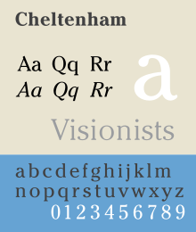
| Category | Serif |
|---|---|
| Classification | old style |
| Designer(s) | Bertram Grosvenor Goodhue Ingalls Kimball |
| Foundry | American Type Founders |
| Date released | 1903 |
| Shown here | ITC Cheltenham |
Cheltenham is a typeface for display use designed in 1896 by architect Bertram Goodhue and Ingalls Kimball, director of the Cheltenham Press. The original drawings were known as Boston Old Style and were made about 14" high. These drawings were then turned over to Morris Fuller Benton at American Type Founders (ATF) who developed it into a final design. Trial cuttings were made as early as 1899 but the face was not complete until 1902. The face was patented by Kimball in 1904. Later the basic face was spun out into an extensive type family by Morris Fuller Benton.[1]
Cheltenham is not based on a single historical model, and shows influences of the Arts and Crafts Movement. Originally intended as a text face, "Chelt" became hugely successful as the "king of the display faces." Part of the face's huge popularity is because, as it has elements of both an old style and transitional face, a Cheltenham headline complements virtually any body type.[2] The overwhelming popularity of the face for display purposes lasted until the advent of the geometric sans-serif typefaces of the 1930s.
YouTube Encyclopedic
-
1/1Views:2 978
-
7 Architecture Facts pt.46 | New York Times, Scarpa, & The Low House
Transcription
Foundry Type
The following versions were available in foundry type:[3]
- ATF's Cheltenham series
- Cheltenham (1903, Bertram Goodhue, Ingalls Kimball, Morris Fuller Benton and/or Joseph W. Phinney)
- Cheltenham Bold (1903, Morris Fuller Benton)
- Cheltenham Bold Condensed (1904, Morris Fuller Benton)
- Cheltenham Bold Italic + Cheltenham Bold Condensed Italic + Cheltenham Wide + Cheltenham Bold Outline (1905, Morris Fuller Benton)
- Cheltenham Bold Extra Condensed + Cheltenham Bold Extended (1906, Morris Fuller Benton)
- Cheltenham Inline + Cheltenham Inline Extra Condensed'
- Cheltenham Inline Extended (1907, Morris Fuller Benton)
- Cheltenham Oldstyle Condensed + Cheltenham Medium (1909, Morris Fuller Benton)
- Cheltenham Medium Italic + Cheltenham Extra Bold (1910, Morris Fuller Benton)
- Cheltenham Bold Shaded + Cheltenham Bold Italic Shaded + Cheltenham Extra Bold Shaded (1912, Morris Fuller Benton)
- Cheltenham Medium Condensed + Cheltenham Medium Expanded (1913, Morris Fuller Benton)
- Venetian (1911, Morris Fuller Benton) was originally called Cheltenham #2, but its resemlance to the original face was only slight.
- Linotype, Monotype, and Ludlow all produced their own Cheltenham under that name and with almost as many variations as ATF. A few new variations were added:
- Cheltenham Cursive (R. Hunter Middleton, Ludlow)
- Cheltenham Wide Italic (Sol Hess, Monotype)
- Intertype called their version Cheltonian
- Western Type Foundry called their version Chesterfield
- Hansen Type Foundry called their version Craftsman
- Inland Type Foundry called their version Kenilworth (1904)
- Keystone Type Foundry called their version Lowell (1905, Charles W. Smith)
- Stephenson Blake called their version Winchester
- English Monotype called their version Gloucester
- Berthold called their version Sorbonne (1905)
Cold Type Versions
The popularity of Cheltenham continued strong right in the cold type era, and it was offered by various manufacturers under the following names:[4]
A cold type variant ITC Cheltenham, was also designed by Tony Stan for the International Typeface Corporation, in 1975. It features a larger x-height and improved italic details. The family includes 4 weights and 2 width each, with complementary italics.
Digital versions
The original face has been digitized by the current owner, Kingsley/ATF and is sold by Bitstream Inc. The ITC version is also available from Linotype, Monotype, and Adobe Systems, along with ITC Cheltenham Handtooled, a 1993 version with highlight, designed by Ed Benguiat. Other versions are available from Tilde, Font Bureau, URW++, Scangraphic Digital Type Collection, and Elsner+Flake. Besley Clarendon is available from HiH. Monotype offers its version under the name Gloucester.[5]
Prominent usage
In 2003, The New York Times introduced a more unified Cheltenham typographic palette for its headline use in the print edition. Previously, Cheltenham was only one of several types including a sans-serif in a Victorian looking mix of headline faces. Tom Bodkin, assistant managing editor and design director of the Times, engaged typeface designer Matthew Carter to create multiple weights and a heavily condensed width of Cheltenham to replace most of the Latin Extra Condensed face in use, as well as Bookman and a variant of Century Bold.[6]
In the U.S. Congress the bill or resolution number of all bills and resolutions set for public printing is set in Cheltenham.[7] The typeface is also featured within the bills and laws themselves to designate title and section headings.
The Liturgical Press uses the Cheltenham Bold typeface for Lectionaries prescribed by the United States Conference of Catholic Bishops for Roman Catholic dioceses in the United States.
IDG's ...for Dummies series of how-to books are set in ITC Cheltenham.
L.L.Bean's logo is set in Cheltenham.
Akai's logo is set in ITC Cheltenham Ultra.
The street name plaques of Helsinki are set in Cheltenham.[8]
This font is used prominently in the Japanese anime Cowboy Bebop, most notably for the ending cards of each episode, usually with the phrase "See you Space Cowboy..."[citation needed]
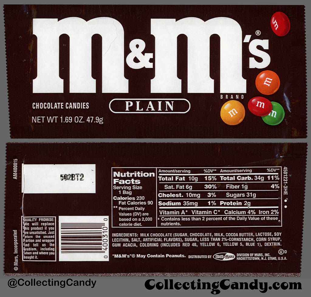
From 1992 to 2000, Mars Incorporated used this font for the flavor descriptions (Plain, Peanut, etc.) of the M&M's candies.[9][10]
Bibliography
- Blackwell, Lewis. 20th Century Type. Yale University Press: 2004. ISBN 0-300-10073-6.
- Fiedl, Frederich, Nicholas Ott and Bernard Stein. Typography: An Encyclopedic Survey of Type Design and Techniques Through History. Black Dog & Leventhal: 1998. ISBN 1-57912-023-7.
- Jaspert, W. Pincus, W. Turner Berry and A.F. Johnson. The Encyclopedia of Type Faces. Blandford Press Lts.: 1953, 1983. ISBN 0-7137-1347-X.
- Lawson, Alexander S., Anatomy of a Typeface. Godine: 1990. ISBN 978-0-87923-333-4.
- Macmillan, Neil. An A–Z of Type Designers. Yale University Press: 2006. ISBN 0-300-11151-7.
References
- ^ Some sources say that Joseph W. Phinney, head of ATF's design department, and not Benton, was responsible for finishing the type. See Mac McGrew, American Metal Typefaces of the Twentieth Century, Oak Knoll Books, New Castle Delaware, 1993, ISBN 0-938768-34-4, pp. 84 - 89.
- ^ Hlasta, Stanley C., Printing Types & How to Use Them, Carnegie Press, Pittsburgh, Pennsylvania, 1950, p. 217.
- ^ McGrew, Mac, American Metal Typefaces of the Twentieth Century, Oak Knoll Books, New Castle Delaware, 1993, ISBN 0-938768-34-4, pp. 84 - 89.
- ^ W.F. Wheatley, Typeface Analogue, National Composition Association, Arlington, Virginia, 1988, p. 8. pp. 34 - 35.
- ^ "Gloucester". MyFonts. Monotype Imaging. Retrieved 30 March 2021.
- ^ By The New York Times. "A Face Lift for the Times, Typographically, That Is'" The New York Times, October 21, 2003, retrieved March 15, 2007.
- ^ U.S. Government Printing Office. [1] retrieved October 27, 2013.
- ^ By The Guardian. "Walking tour of Helsinki's architecture'" The Guardian, June 10, 2012, retrieved September 29, 2012.
- ^ Jason, Liebig (January 31, 2017). "Mars – M&M's Plain – 1.69 oz candy package – 1995". Collecting Candy. Archived from the original on 2021-10-19.
- ^ Jason, Liebig (January 31, 2017). "How a 1970's Russian "Red Scare" Set M&M's Mascots Back Twenty Years!". Collecting Candy. Archived from the original on 2017-05-07.
External links
- MyFonts: Cheltenham
- ITC Cheltenham Font Family - by Tony Stan
- ITC Classics: ITC Cheltenham
- ITC Cheltenham Handtooled Font Family - by Edward Benguiat
- Type Trading Card #12: ITC Cheltenham and ITC Tactile
- Cheltenham, l'american way of designing type (in French)
- ATF 1923 Catalog: Cheltenham - Morris Fuller Benton - on Luc Devroye's encyclopedic pages, who quote Mac McGrew with many details