


In science and engineering, a semi-log plot/graph or semi-logarithmic plot/graph has one axis on a logarithmic scale, the other on a linear scale. It is useful for data with exponential relationships, where one variable covers a large range of values.[1]
All equations of the form form straight lines when plotted semi-logarithmically, since taking logs of both sides gives


This is a line with slope and vertical intercept. The logarithmic scale is usually labeled in base 10; occasionally in base 2:


A log–linear (sometimes log–lin) plot has the logarithmic scale on the y-axis, and a linear scale on the x-axis; a linear–log (sometimes lin–log) is the opposite. The naming is output–input (y–x), the opposite order from (x, y).
On a semi-log plot the spacing of the scale on the y-axis (or x-axis) is proportional to the logarithm of the number, not the number itself. It is equivalent to converting the y values (or x values) to their log, and plotting the data on linear scales. A log–log plot uses the logarithmic scale for both axes, and hence is not a semi-log plot.
YouTube Encyclopedic
-
1/5Views:99 6891 71982 018414 1054 286
-
Semi-Log Graph Tutorial
-
PHARMACEUTICAL ENGINEERING: How to do Semi-Log Graph
-
How to plot semi log graph sheet for filter frequency response
-
Logarithmic scale | Logarithms | Algebra II | Khan Academy
-
Intro to Semi-Log Graph (Water Column Decay Example)
Transcription
Equations
The equation of a line on a linear–log plot, where the abscissa axis is scaled logarithmically (with a logarithmic base of n), would be

The equation for a line on a log–linear plot, with an ordinate axis logarithmically scaled (with a logarithmic base of n), would be:


Finding the function from the semi–log plot
Linear–log plot
On a linear–log plot, pick some fixed point (x0, F0), where F0 is shorthand for F(x0), somewhere on the straight line in the above graph, and further some other arbitrary point (x1, F1) on the same graph. The slope formula of the plot is:

which leads to

or

which means that

In other words, F is proportional to the logarithm of x times the slope of the straight line of its lin–log graph, plus a constant. Specifically, a straight line on a lin–log plot containing points (F0, x0) and (F1, x1) will have the function:
![{\displaystyle F(x)=(F_{1}-F_{0}){\left[{\frac {\log _{n}(x/x_{0})}{\log _{n}(x_{1}/x_{0})}}\right]}+F_{0}=(F_{1}-F_{0})\log _{\frac {x_{1}}{x_{0}}}{\left({\frac {x}{x_{0}}}\right)}+F_{0}}](https://wikimedia.org/api/rest_v1/media/math/render/svg/da143562dac9e25d0e2a741861ef66bb7077d6f6)
log–linear plot
On a log–linear plot (logarithmic scale on the y-axis), pick some fixed point (x0, F0), where F0 is shorthand for F(x0), somewhere on the straight line in the above graph, and further some other arbitrary point (x1, F1) on the same graph. The slope formula of the plot is:

which leads to

Notice that nlogn(F1) = F1. Therefore, the logs can be inverted to find:

or

This can be generalized for any point, instead of just F1:

Real-world examples
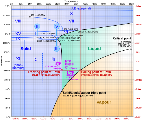
Phase diagram of water
In physics and chemistry, a plot of logarithm of pressure against temperature can be used to illustrate the various phases of a substance, as in the following for water:
2009 "swine flu" progression
While ten is the most common base, there are times when other bases are more appropriate, as in this example:[further explanation needed]

Notice that while the horizontal (time) axis is linear, with the dates evenly spaced, the vertical (cases) axis is logarithmic, with the evenly spaced divisions being labelled with successive powers of two. The semi-log plot makes it easier to see when the infection has stopped spreading at its maximum rate, i.e. the straight line on this exponential plot, and starts to curve to indicate a slower rate. This might indicate that some form of mitigation action is working, e.g. social distancing.
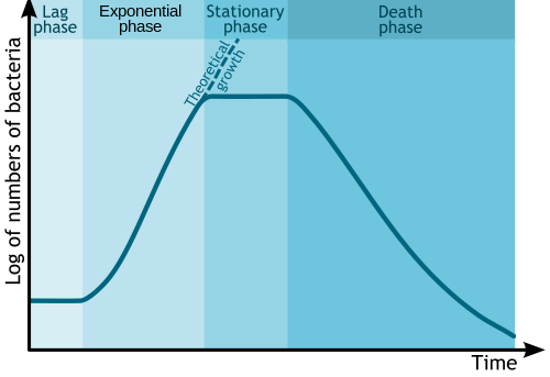
Microbial growth
In biology and biological engineering, the change in numbers of microbes due to asexual reproduction and nutrient exhaustion is commonly illustrated by a semi-log plot. Time is usually the independent axis, with the logarithm of the number or mass of bacteria or other microbe as the dependent variable. This forms a plot with four distinct phases, as shown below.
See also
- Nomograph, more complicated graphs
- Nonlinear regression#Transformation, for converting a nonlinear form to a semi-log form amenable to non-iterative calculation
- Log–log plot
References
- ^ (1) Bourne, M. "Graphs on Logarithmic and Semi-Logarithmic Paper". Interactive Mathematics. www.intmath.com. Archived from the original on August 6, 2021. Retrieved October 26, 2021.
(2) Bourne, Murray (January 25, 2007). "Interesting semi-logarithmic graph – YouTube Traffic Rank". SquareCirclez: The IntMath blog. www.intmath.com. Archived from the original on February 26, 2021. Retrieved October 26, 2021.