
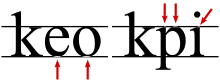
In typeface design, the overshoot of a round or pointed letter (like O or A) is the degree to which it extends higher or lower than a comparably sized "flat" letter (like X or H), to achieve an optical effect of being the same size; it compensates for inaccuracies in human visual perception.[1][2][3]
Formally, overshoot is the degree to which capital letters go below the baseline or above the cap height, or to which a lowercase letter goes below the baseline or above the x-height.[4]
For example, the highest and lowest extent of the capital O will typically exceed those of the capital X. Although the extent of overshoot varies depending on the design and the designer, perhaps 1% to 3% of the cap or x-height is typical for O. Peter Karow's Digital Formats for Typefaces recommends 3% for O and 5% for A.[5][6]
YouTube Encyclopedic
-
1/3Views:46 69448 32589 043
-
Expressive Typography Design & Layout Critique & Advice (Cutdown)
-
Smooth Bouncy Text Animation Tutorial in After Effects | Overshoot Bounce | No Plugins
-
Typeface Design & Font Making Process w/Mark Davis
Transcription
Similar design
Typefaces are born from the struggle between rules and results. Squeezing a square about 1% helps it look more like a square; to appear the same height as a square, a circle must be measurably taller. The two strokes in an X aren't the same thickness, nor are their parallel edges actually parallel; the vertical stems of a lowercase alphabet are thinner than those of its capitals; the ascender on a d isn't the same length as the descender on a p, and so on. For the rational mind, type design can be a maddening game of drawing things differently in order to make them appear the same.
Similar subtle adjustments to create an even appearance occur in other fields. For example, in the game of go, the stones, which are black and white, are of slightly different sizes (black slightly larger), to give the appearance of being the same size.
References
- ^ Frere-Jones, Tobias (9 April 2015). "This Optical Illusion Tricks You Into Thinking That Typeface Letters Are the Same Height". Slate. Retrieved 9 April 2015.
- ^ Moore, Ian. "Making Geometric Type Work". Typographica. Retrieved 2 February 2016.
- ^ Heidrun Osterer; Philipp Stamm (8 May 2014). Adrian Frutiger – Typefaces: The Complete Works. Birkhäuser. p. 333. ISBN 978-3-03821-260-7.
- ^ Evans, Poppy; Sherin, Aaris (September 2013). The Graphic Design Reference & Specification Book. USA: Rockport Publishers. p. 28. ISBN 978-1-59253-851-5.
- ^ "Glossary of (some) typographical terms".
- ^ Peter Karow (19 January 2012). Digital Formats for Typefaces. Springer. p. 26. ISBN 978-3-642-78107-0.
- ^ Devroye, Luc. "Hoefler & Frere-Jones". Retrieved 21 January 2015.
| Page | |||||||||||
|---|---|---|---|---|---|---|---|---|---|---|---|
| Paragraph | |||||||||||
| Character |
| ||||||||||
| Typeface classifications |
| ||||||||||
| Punctuation | |||||||||||
| Typesetting | |||||||||||
| Typographic units | |||||||||||
| Digital typography | |||||||||||
| Typography in other writing systems | |||||||||||
| Related articles | |||||||||||
| Related tables | |||||||||||