
 | |
| Category | Sans-serif |
|---|---|
| Classification | Geometric sans-serif Grotesque sans-serif |
| Designer(s) | Wilhelm Pischner |
| Foundry | Stempel Linotype |
| Date released | 1928-9, 1959, 1966 |
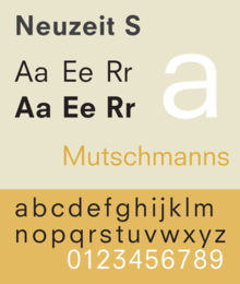
Neuzeit S is a sans-serif typeface designed by Wilhelm Pischner in 1928 (as Neuzeit-Buch) and 1928 (as Neuzeit-Buch S) for Linotype[1] and a corporate typeface for Siemens. The German name translates to English as "new time" and refers to the modern era. The face combines characteristics of both geometric and neo-grotesque sans-serif classifications, and is based on Neuzeit Grotesk, a more purely geometric sans-serif designed by Wilhelm Pischner in 1928 for the Stempel Type Foundry.
Neuzeit S is distinct for its contrast of wide circular characters o, O, p, q, and Q with the more compact characters h, n, u, and t.
- Fox News Channel uses this typeface as one of its lower third typefaces.
References
External links
- Adobe web page for Neuzeit S
- MyFonts, Neuzeit S
- Neuzeit Office (redesign intended to work better in body text)
- Fonts In Use profile for Neuzeit S
This typography-related article is a stub. You can help Wikipedia by expanding it. |